Sixteen Eleven Studios
Website Redesign
A fresh look for 1611
Overview
During my internship at Sixteen Eleven Studios, I was asked to redesign the studio’s website to better showcase everything the space has to offer. As a multi-purpose creative studio, the website needed to communicate its versatility while still feeling cohesive and easy to navigate.
The goal was to create something that felt clean and professional without losing the personality of the space. I combined a structured layout with bold type, playful details, and strong imagery to reflect the studio’s creative and unconventional character.
Want to skip ahead?
Research Insight – Making Space for More
Problem
Too many ways in - The original site offered a lot of information, but the different ways to use the studio weren’t always immediately clear.
The space was doing a lot of talking - The original website relied heavily on large galleries and imagery to communicate the studio, but there was an opportunity to make the space itself feel more intentional within the overall experience.
Different offerings, one studio - With events, productions, photoshoots, workshops, pop-ups, and more, Sixteen Eleven has a lot to communicate. The original structure could make those offerings feel more like separate categories than parts of one larger studio.
A more engaging first impression - The client wanted the website to feel more elevated and current, with a stronger visual impact that could capture attention as soon as users landed on the site.
How do you make a website feel like a space?
Solution
Simplified the structure - I reorganized the navigation around the main user needs( services, rates, booking, gallery, press, and contact) making it easier to understand what Sixteen Eleven offers and where to go next.
Let the visuals support the story - I used imagery more strategically alongside typography, movement, and layout to show the versatility of the space without letting the visuals compete with the information.
Created one cohesive system - I brought the different offerings under a clearer visual and navigational system, while still giving each service enough space to feel distinct. The redesign now introduces the studio through its different uses, including event space, photography studio, workshop venue, pop-up space, and production studio.
Added movement and interaction - I introduced purposeful animations, transitions, and interactive moments throughout the site to create a more dynamic experience. These details add personality and help the website feel closer to the energy of the physical studio, while keeping the overall experience clean and intentional.
Design Approach
E6E5E1
474725
Colour Palette
The colour palette is simple with black typography and a muted beige background, creating a clean base that lets the photography bring in colour, texture, and personality.

Typography
We used three typefaces to create a clear hierarchy: a serif for titles (SA Magazine), a type-focused sans serif for subheads
(IBM Plex Mono), and a simple sans serif for body copy and smaller details (Acumin Variable Concept).
Mood Board

Planning
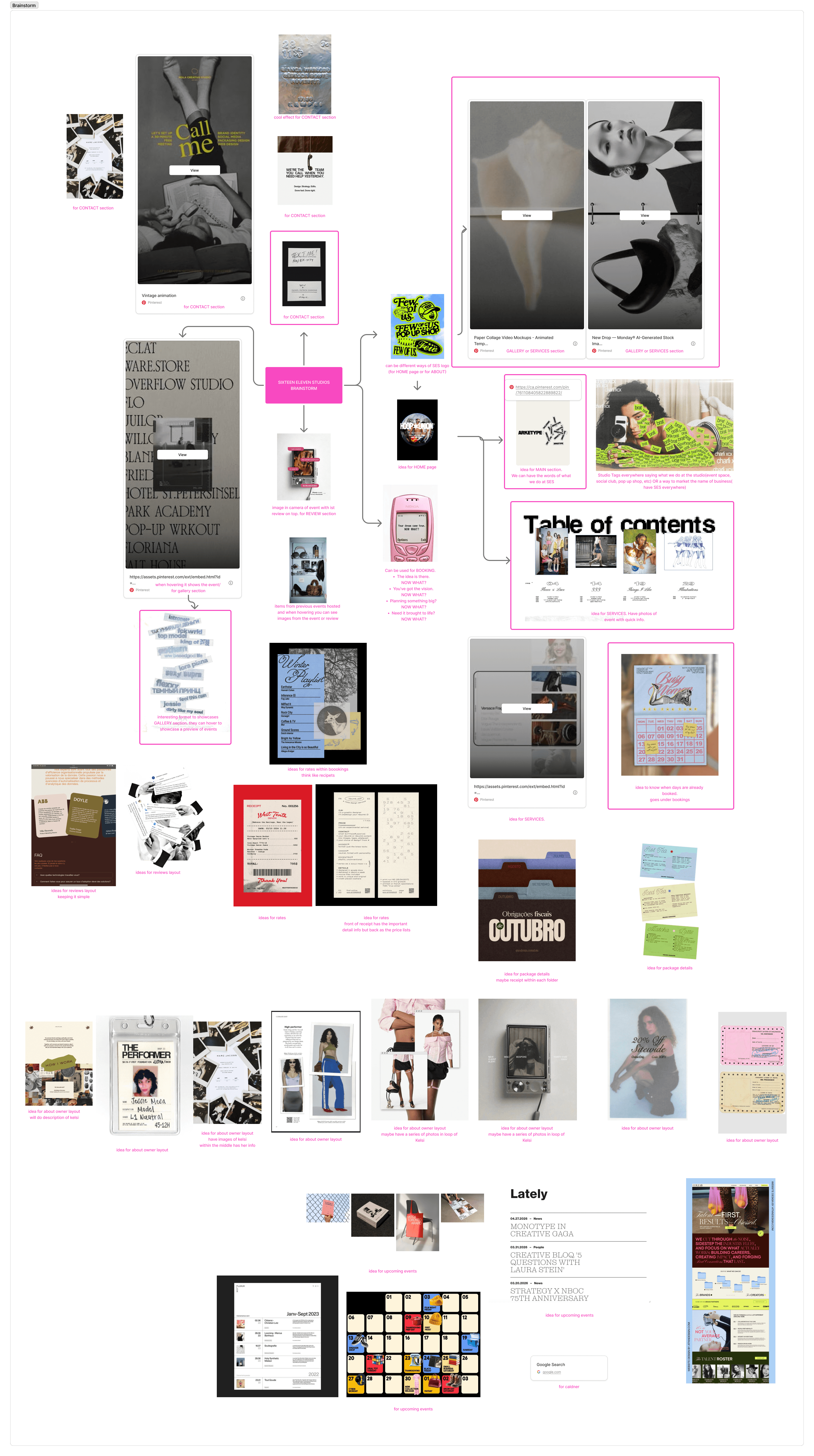
Explore the full site below <3
Outcome
The final website brings the personality and versatility of Sixteen Eleven Studios into one cohesive digital experience. It showcases the different ways the space can be used while keeping the overall design clean, elevated, and true to the studio’s creative character. The new site also creates a stronger foundation for the studio to grow, giving it the flexibility to evolve alongside its services, events, and creative projects in the years ahead.
Project Type
UX/UI
Duration
4 Weeks
Tools
Framer | Photoshop | Illustrator
Sixteen Eleven Studios
Website Redesign
A fresh look for 1611
Overview
During my internship at Sixteen Eleven Studios, I was asked to redesign the studio’s website to better showcase everything the space has to offer. As a multi-purpose creative studio, the website needed to communicate its versatility while still feeling cohesive and easy to navigate.
The goal was to create something that felt clean and professional without losing the personality of the space. I combined a structured layout with bold type, playful details, and strong imagery to reflect the studio’s creative and unconventional character.
Want to skip ahead?
Research Insight – Making Space for More
Problem
Too many ways in - The original site offered a lot of information, but the different ways to use the studio weren’t always immediately clear.
The space was doing a lot of talking - The original website relied heavily on large galleries and imagery to communicate the studio, but there was an opportunity to make the space itself feel more intentional within the overall experience.
Different offerings, one studio - With events, productions, photoshoots, workshops, pop-ups, and more, Sixteen Eleven has a lot to communicate. The original structure could make those offerings feel more like separate categories than parts of one larger studio.
A more engaging first impression - The client wanted the website to feel more elevated and current, with a stronger visual impact that could capture attention as soon as users landed on the site.
How do you make a website feel like a space?
Solution
Simplified the structure - I reorganized the navigation around the main user needs( services, rates, booking, gallery, press, and contact) making it easier to understand what Sixteen Eleven offers and where to go next.
Let the visuals support the story - I used imagery more strategically alongside typography, movement, and layout to show the versatility of the space without letting the visuals compete with the information.
Created one cohesive system - I brought the different offerings under a clearer visual and navigational system, while still giving each service enough space to feel distinct. The redesign now introduces the studio through its different uses, including event space, photography studio, workshop venue, pop-up space, and production studio.
Added movement and interaction - I introduced purposeful animations, transitions, and interactive moments throughout the site to create a more dynamic experience. These details add personality and help the website feel closer to the energy of the physical studio, while keeping the overall experience clean and intentional.
Design Approach
E6E5E1
474725
Colour Palette
The colour palette is simple with black typography and a muted beige background, creating a clean base that lets the photography bring in colour, texture, and personality.
Typography
We used three typefaces to create a clear hierarchy: a serif for titles (SA Magazine), a type-focused sans serif for subheads
(IBM Plex Mono), and a simple sans serif for body copy and smaller details (Acumin Variable Concept).
Mood Board
Planning
Explore the full site below <3
Outcome
The final website brings the personality and versatility of Sixteen Eleven Studios into one cohesive digital experience. It showcases the different ways the space can be used while keeping the overall design clean, elevated, and true to the studio’s creative character. The new site also creates a stronger foundation for the studio to grow, giving it the flexibility to evolve alongside its services, events, and creative projects in the years ahead.
Explore more of my work
Project Type
UX/UI
Duration
4 Weeks
Tools
Framer | Photoshop | Illustrator
Sixteen Eleven Studios
Website Redesign
A fresh look for 1611
Overview
During my internship at Sixteen Eleven Studios, I was asked to redesign the studio’s website to better showcase everything the space has to offer. As a multi-purpose creative studio, the website needed to communicate its versatility while still feeling cohesive and easy to navigate.
The goal was to create something that felt clean and professional without losing the personality of the space. I combined a structured layout with bold type, playful details, and strong imagery to reflect the studio’s creative and unconventional character.
Want to skip ahead?
Research Insight – Making Space for More
Problem
Too many ways in - The original site offered a lot of information, but the different ways to use the studio weren’t always immediately clear.
The space was doing a lot of talking - The original website relied heavily on large galleries and imagery to communicate the studio, but there was an opportunity to make the space itself feel more intentional within the overall experience.
Different offerings, one studio - With events, productions, photoshoots, workshops, pop-ups, and more, Sixteen Eleven has a lot to communicate. The original structure could make those offerings feel more like separate categories than parts of one larger studio.
A more engaging first impression - The client wanted the website to feel more elevated and current, with a stronger visual impact that could capture attention as soon as users landed on the site.
How do you make a website feel like a space?
Solution
Simplified the structure - I reorganized the navigation around the main user needs( services, rates, booking, gallery, press, and contact) making it easier to understand what Sixteen Eleven offers and where to go next.
Let the visuals support the story - I used imagery more strategically alongside typography, movement, and layout to show the versatility of the space without letting the visuals compete with the information.
Created one cohesive system - I brought the different offerings under a clearer visual and navigational system, while still giving each service enough space to feel distinct. The redesign now introduces the studio through its different uses, including event space, photography studio, workshop venue, pop-up space, and production studio.
Added movement and interaction - I introduced purposeful animations, transitions, and interactive moments throughout the site to create a more dynamic experience. These details add personality and help the website feel closer to the energy of the physical studio, while keeping the overall experience clean and intentional.
Design Approach
E6E5E1
474725
Colour Palette
The colour palette is simple with black typography and a muted beige background, creating a clean base that lets the photography bring in colour, texture, and personality.
Typography
We used three typefaces to create a clear hierarchy: a serif for titles (SA Magazine), a type-focused sans serif for subheads
(IBM Plex Mono), and a simple sans serif for body copy and smaller details (Acumin Variable Concept).
Mood Board
Planning
Explore the full site below <3
Outcome
The final website brings the personality and versatility of Sixteen Eleven Studios into one cohesive digital experience. It showcases the different ways the space can be used while keeping the overall design clean, elevated, and true to the studio’s creative character. The new site also creates a stronger foundation for the studio to grow, giving it the flexibility to evolve alongside its services, events, and creative projects in the years ahead.
Explore more of my work