Mi Primer Marigold
Coming of Age Intimate
Apparel Collection
For The Woman
She's Becoming
Overview
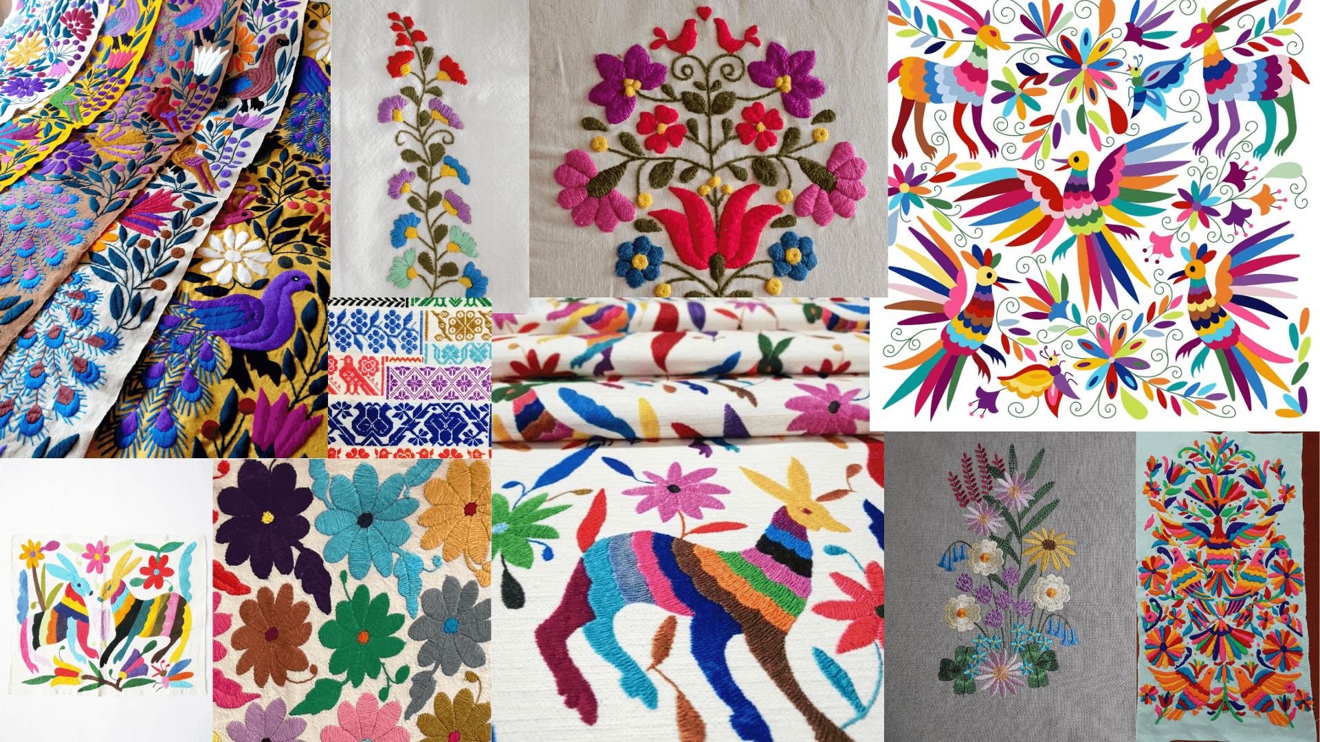
Marigold is a conceptual Canadian handmade intimate apparel brand inspired by traditional Mexican Otomí embroidery and a rustic way of living.The brand is rooted in the experience of growing up in a Mexican household and in the handmade pieces designed by abuelas, each carrying a sense of warmth, familiarity, and personal, rooted memory. The brand's focus is to create a piece that feels both nostalgic and current in design, for everyday wear, with structured silhouettes that offer support, confidence, and comfort.
Mi Primer Marigold is a gentle introduction to the Marigold world, with a lighter, more delicate tone. The collection feels softer and more playful. Featuring lace, ruffles, patchwork, and embroidery, while staying fun, feminine, and casual rather than overly simple. The goal isn’t to remove beauty or detail, but to express it in a more subtle, tender way, using muted base fabrics accented with brighter embroidery and stitching details.
Want to skip ahead?
Research Insight -
Challenging the Visual Stereotypes of Mexican Culture
Mission
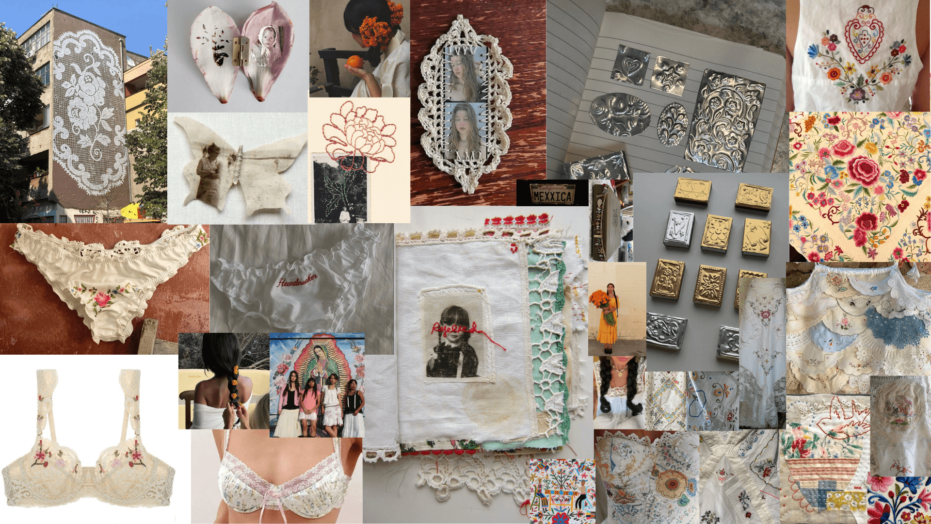
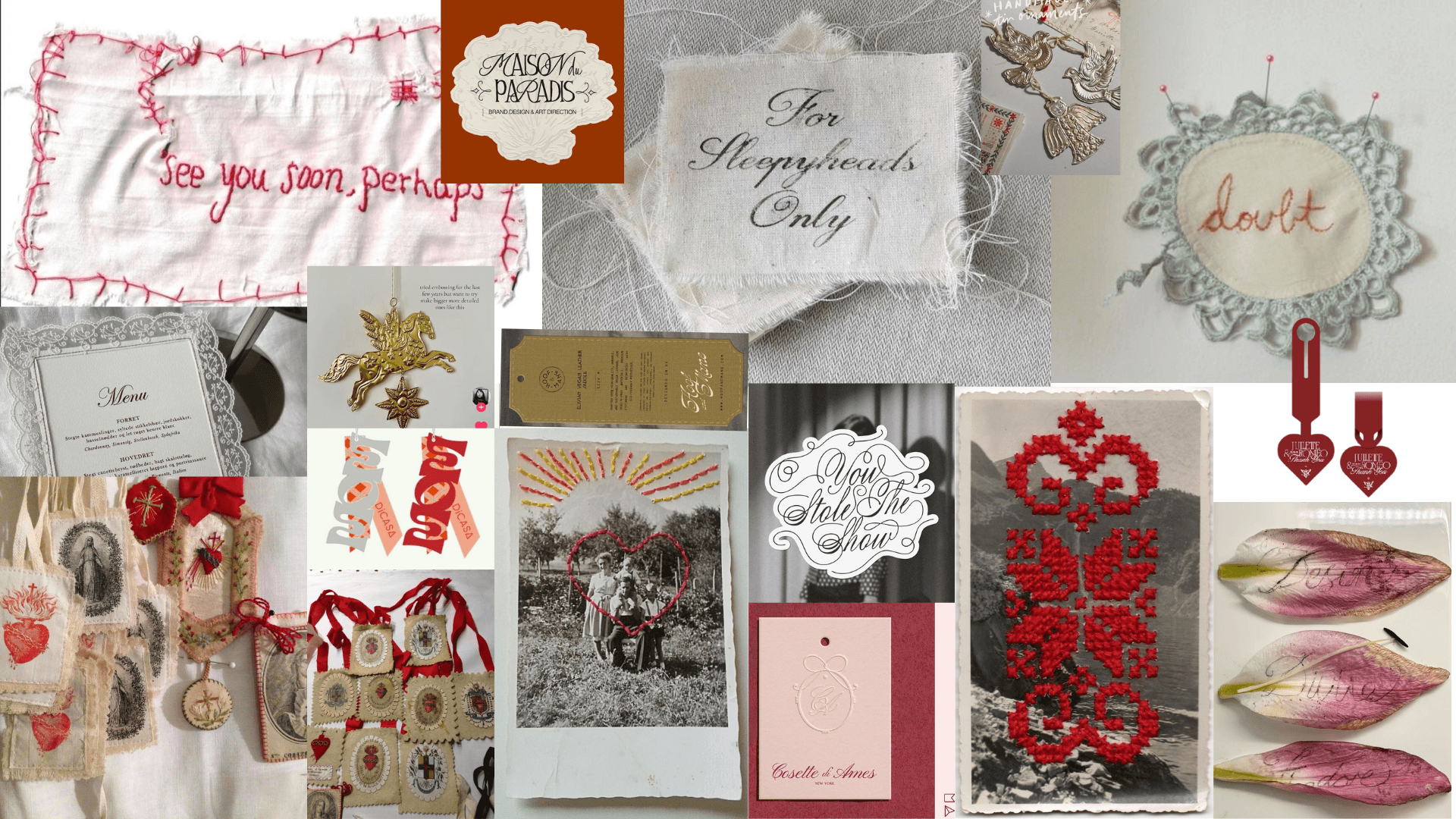
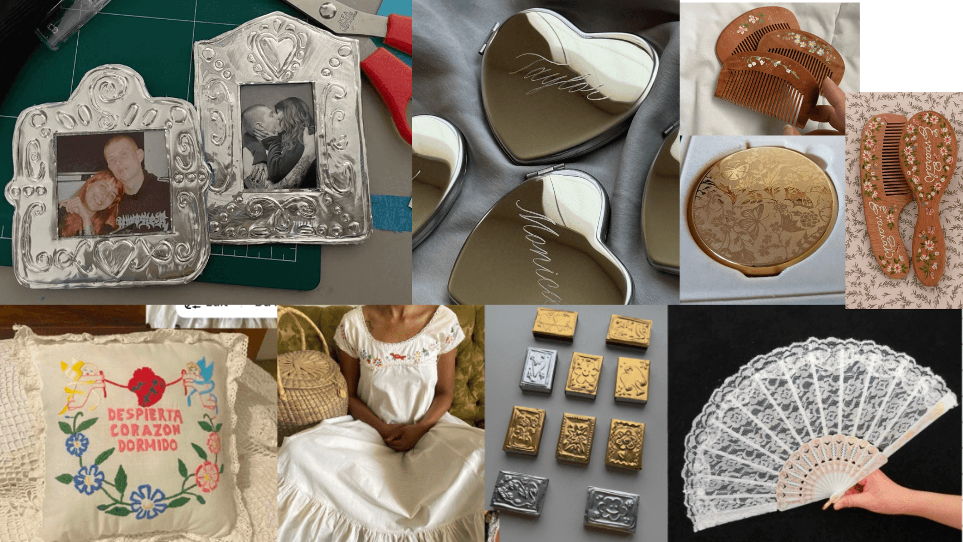
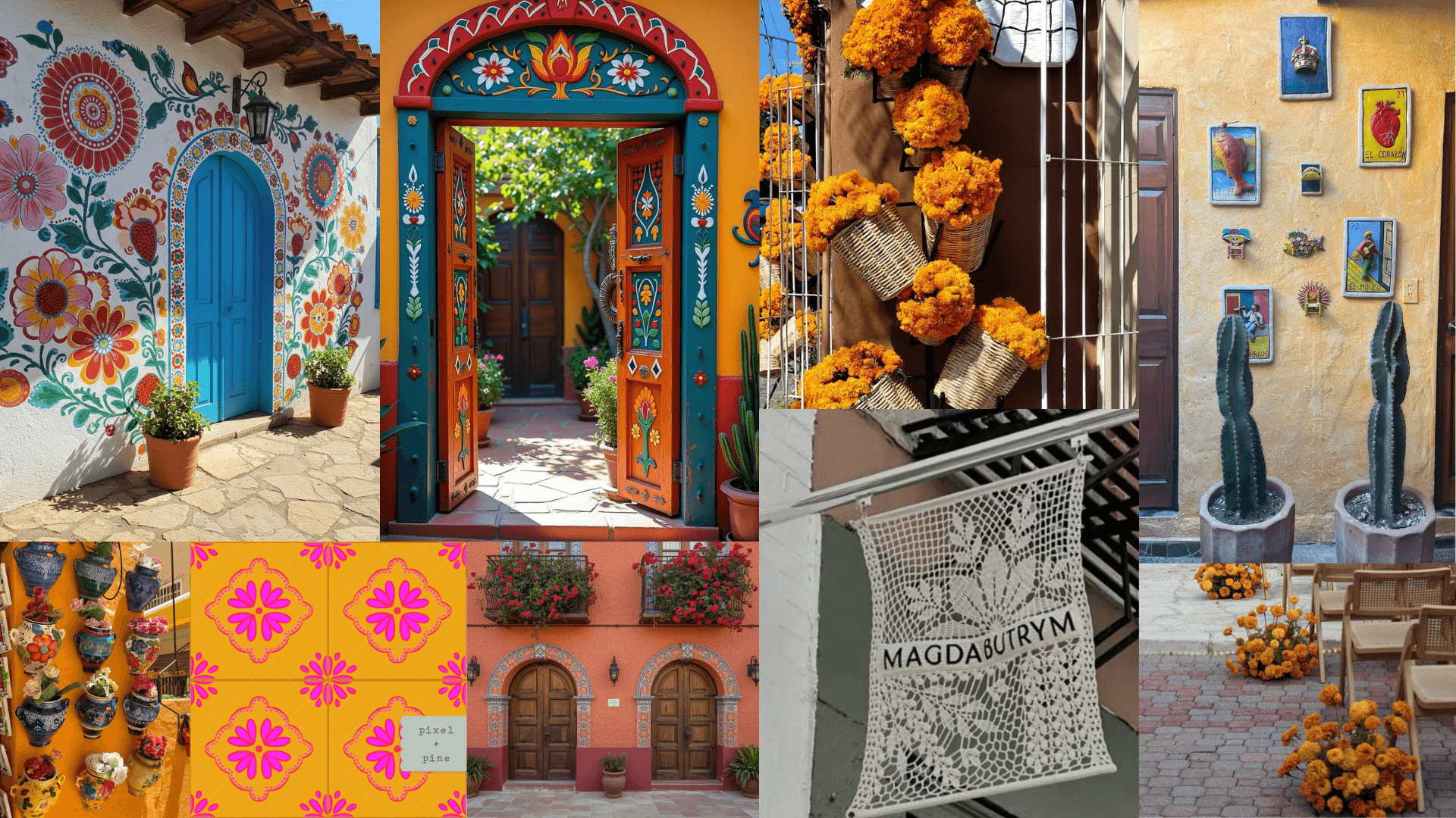
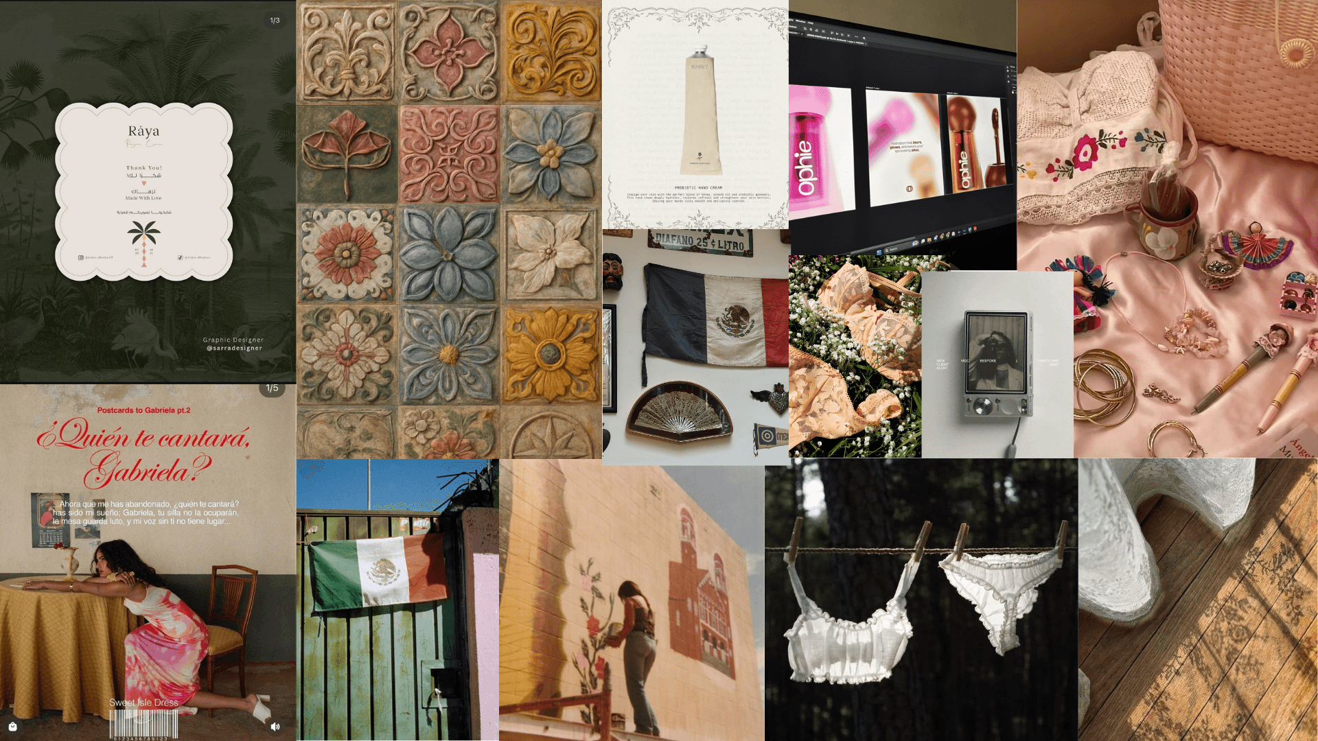
I struggled with how to show Mexican culture in a way that felt true to me, without relying on the bright, bold colours people usually associate with it. When I think of Mexico, I do see colour—but I also see something quieter and more personal: small pueblos, vintage textures, and the soft, worn beauty of everyday life. A lot of that comes from visiting my abuelita and seeing the things she made by hand—colourful, but in a more muted, lived-in way. The challenge was finding a balance between those two ideas, and making sure the designs didn’t feel boring or stripped of their meaning.
How can I tell a more intimate story of
Mexican culture?
Solution
My solution was to keep going back and reworking things until it felt right. Instead of forcing more colour in, I focused on letting the details speak—using embroidery, stitching, and texture to carry that richness. I kept the base more muted and soft, then added small moments of colour in a way that felt intentional. I also looked for references that matched what I had in my head—less of the stereotypical visuals, and more of the quiet, everyday beauty that people who share that experience would recognize. That helped me stay grounded in what I actually wanted the brand to feel like.
Target Audience
Primary Audience - Young Girls
Age Group:
Young girls ages 9 -13 years old
Girls who are beginning puberty and transitioning from training bras to their first everyday bra.
Secondary Audience - Parents
Parents guiding their daughters through this transition, looking for pieces that feel age-appropriate, comfortable, and thoughtfully designed.
Design Approach
D49300
D37300
EFE7DF
000000
EFE7DF
D49300
D37300
000000
Colour Palette
I chose to focus on a more muted, rustic interpretation of Mexico rather than the stereotypical bright colours. The palette is centred around marigold orange—the brand’s signature—supported by soft neutrals like beige, white, and black.

Typography
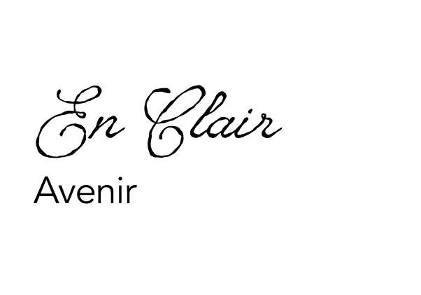
The typography blends expression with clarity. En Clair was chosen as the primary typeface for its cultural character and handwritten imperfections, giving the brand a more personal, intimate feel. It is paired with Avenir, whose clean and modern form helps ground the design and maintain readability.
Mood Boards
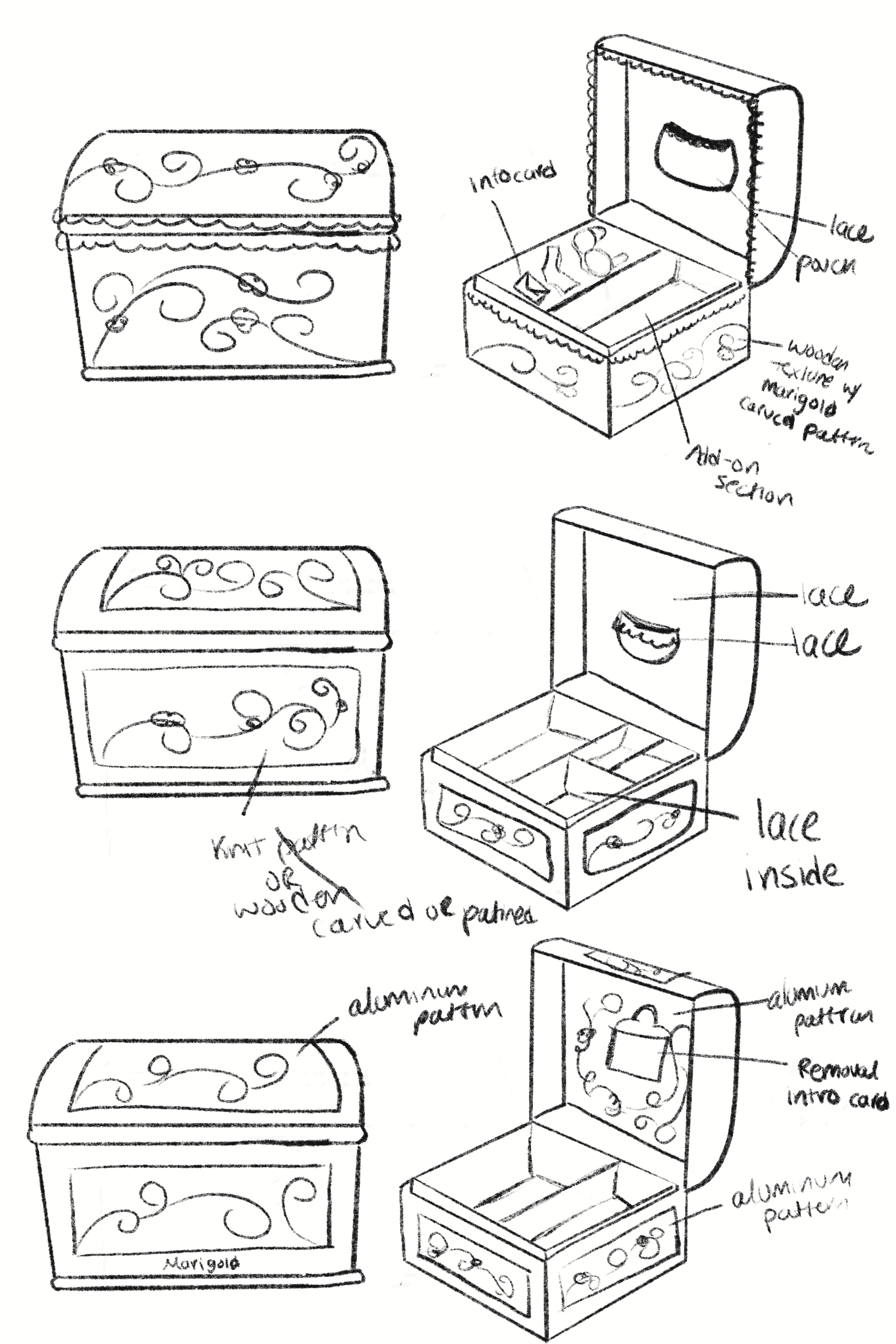
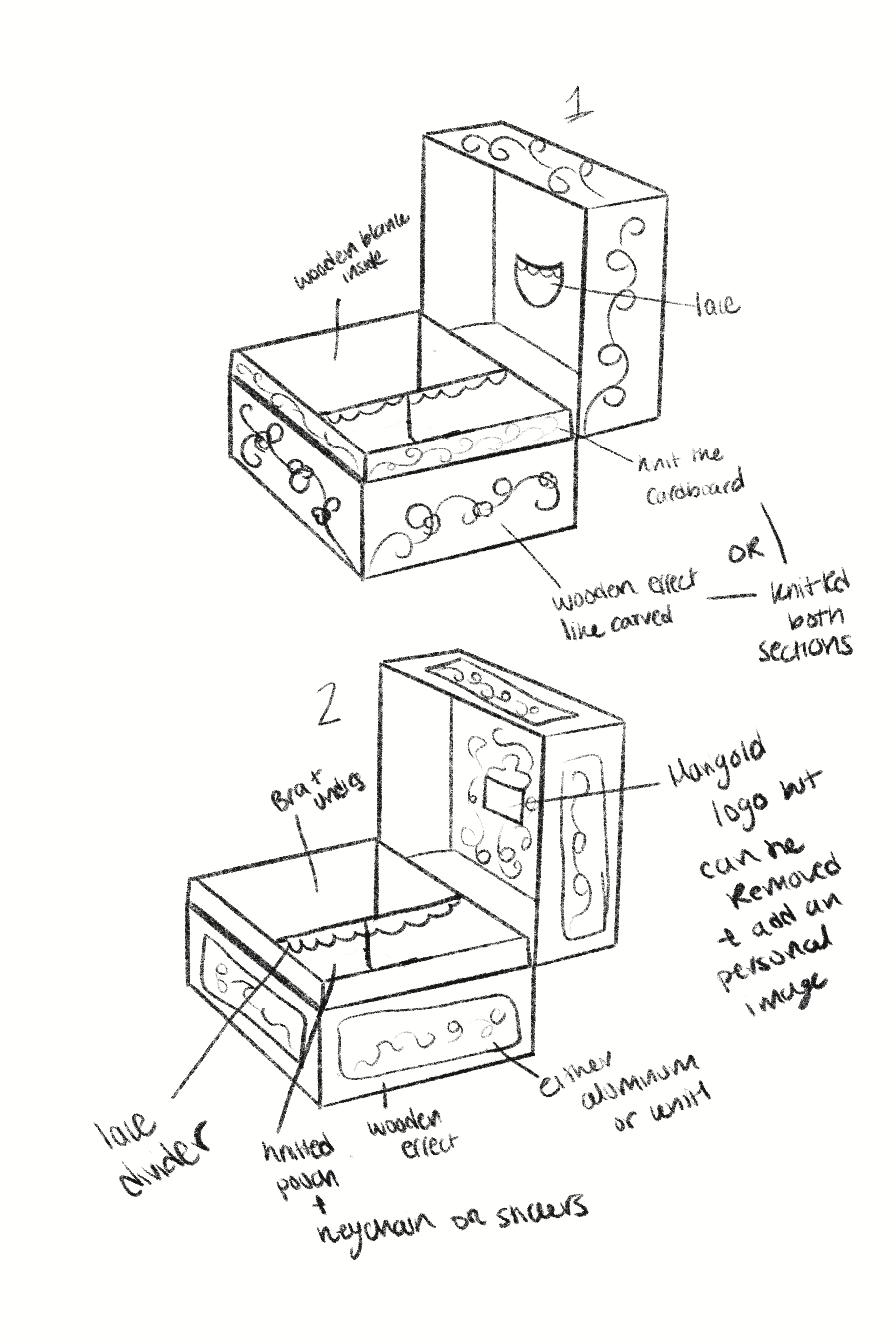
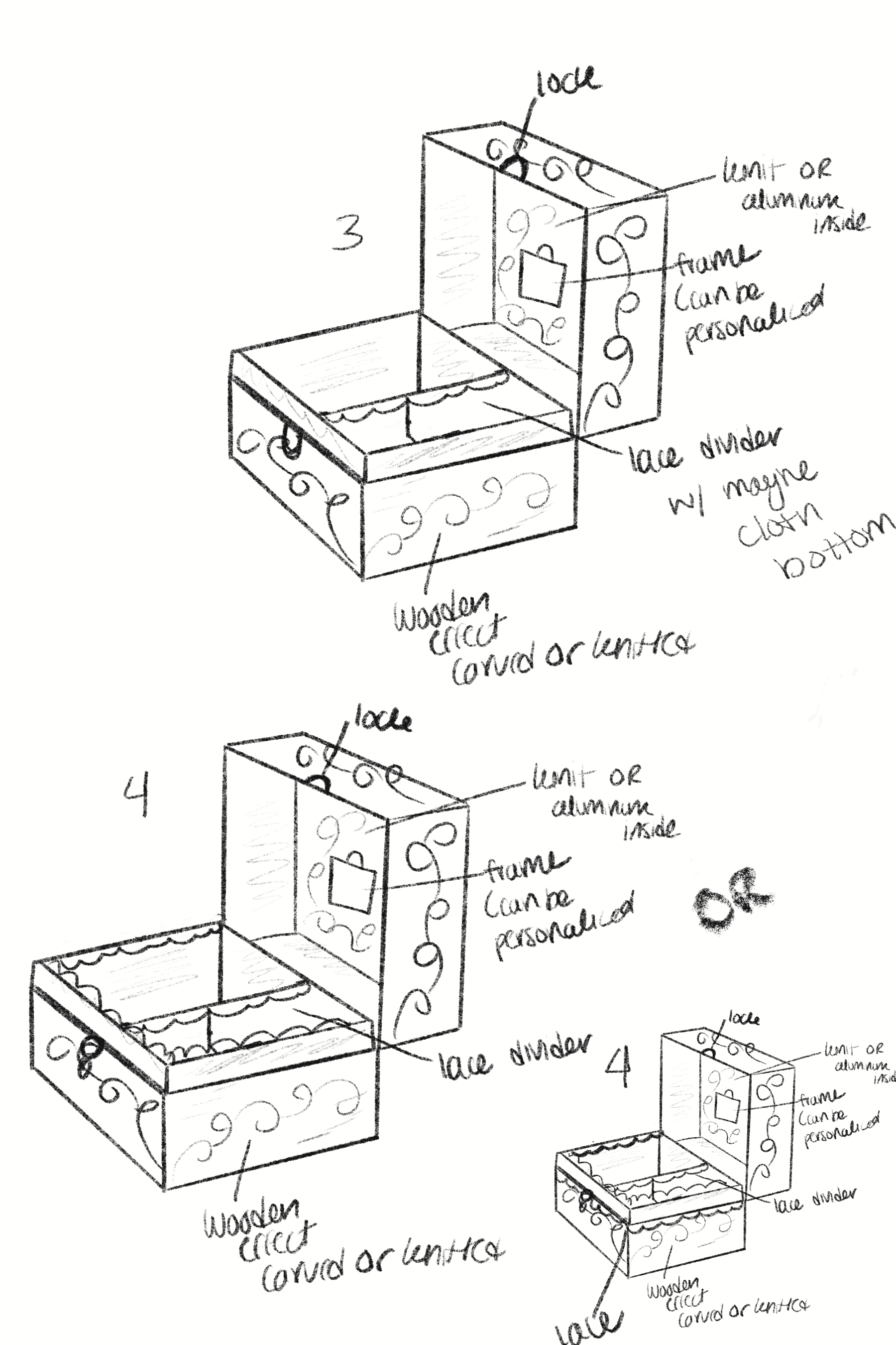
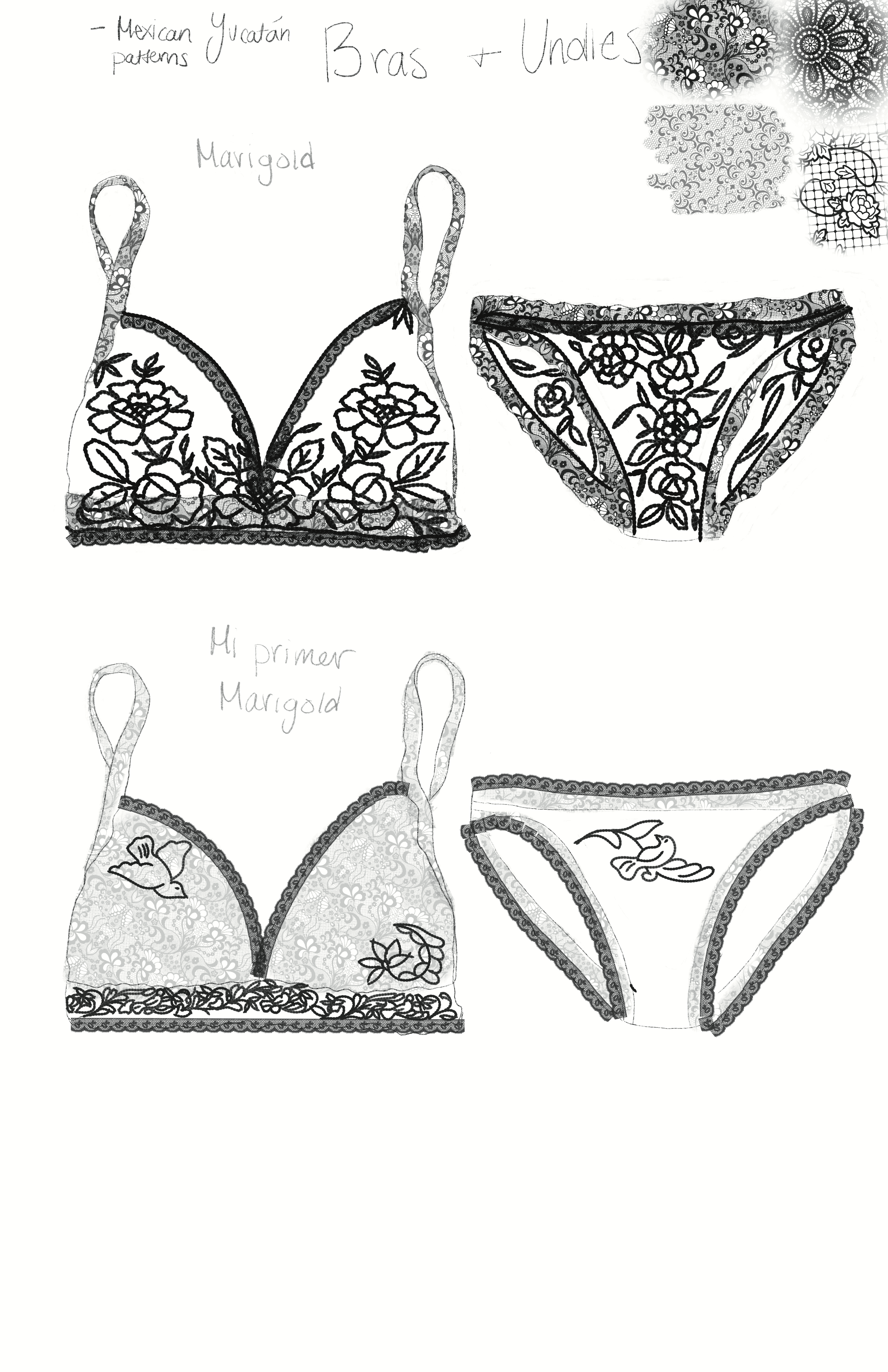
Sketches
Patterns

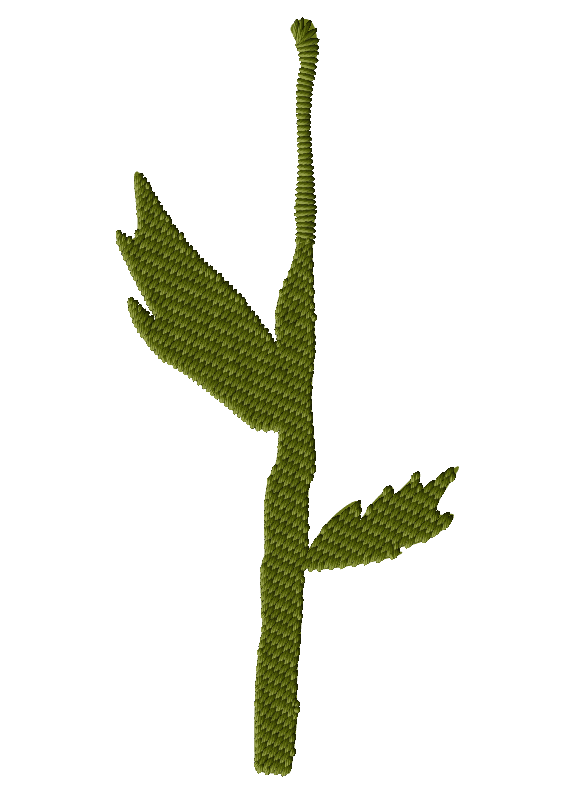
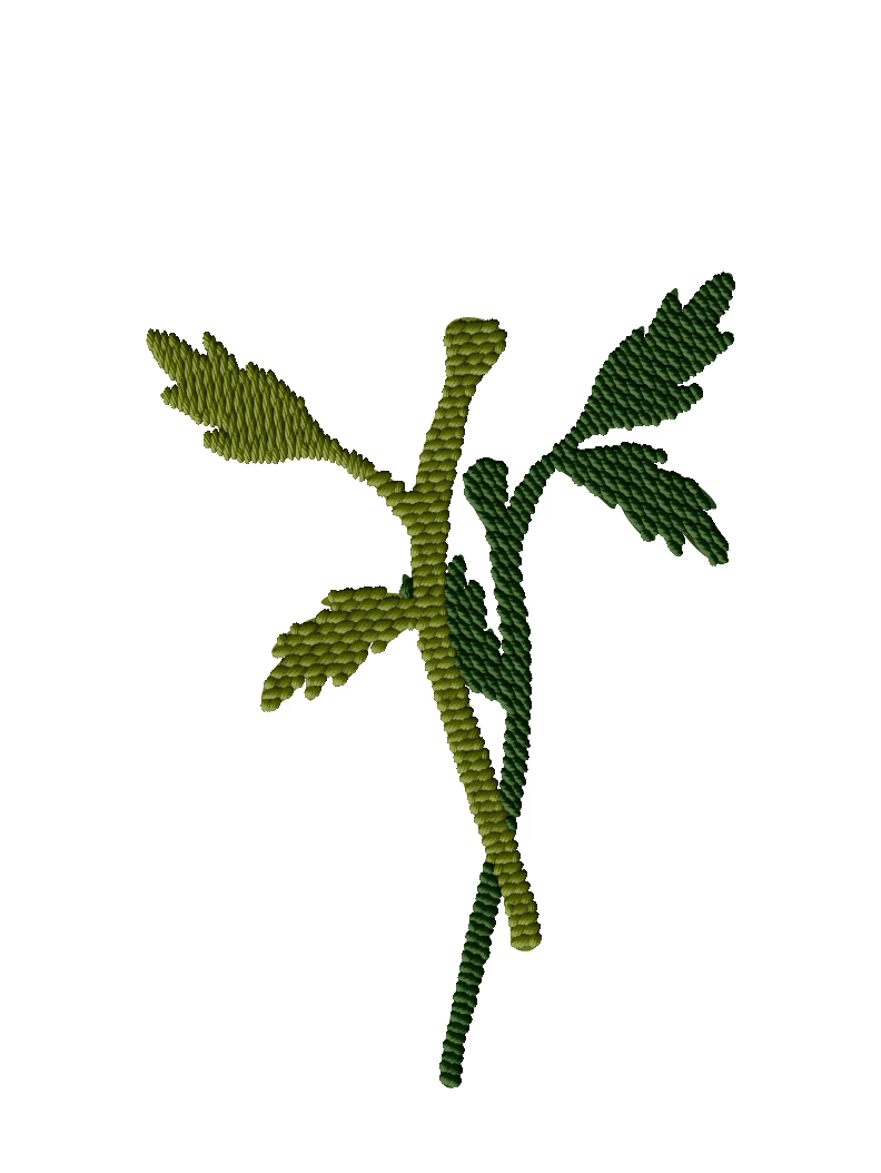

Logo Concept
Logo Mockups
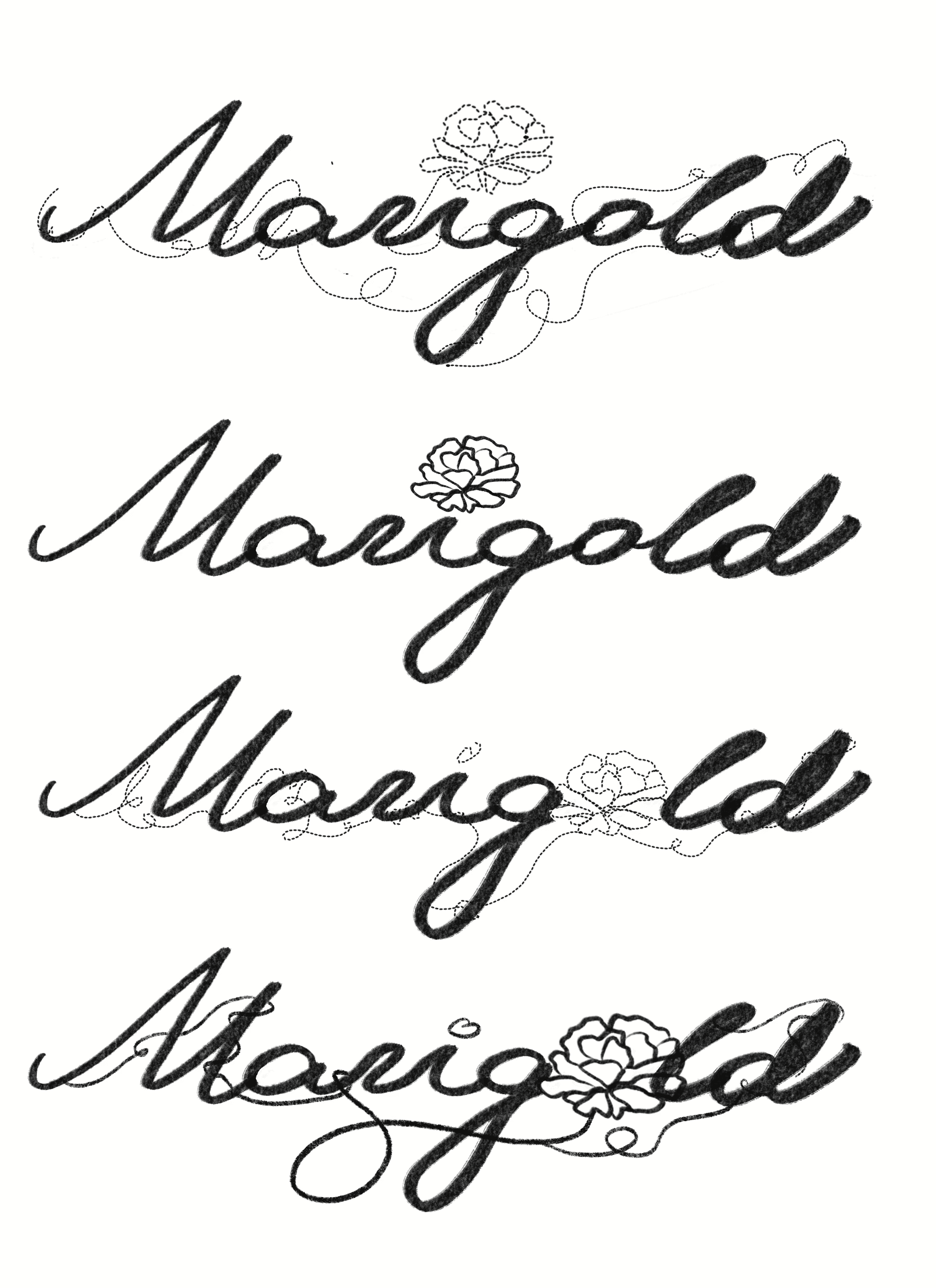
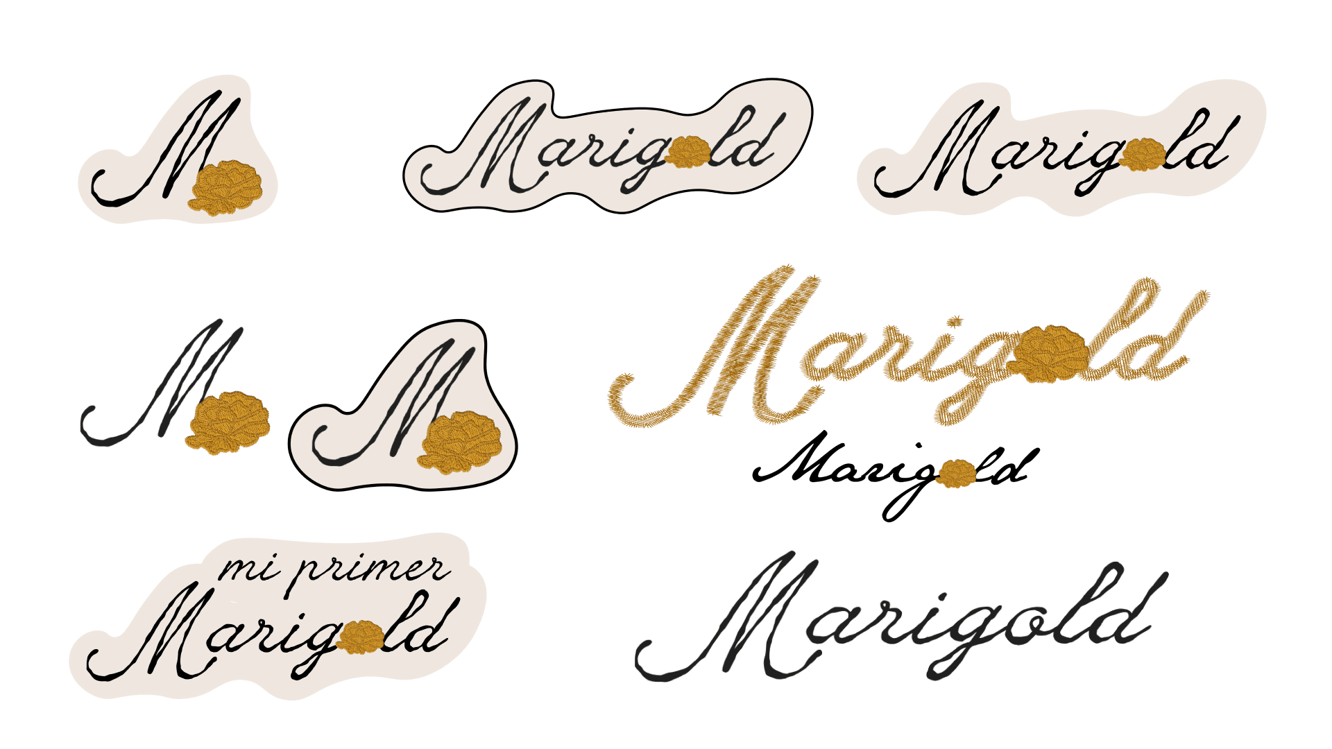
Finalized Logo


Package Concept
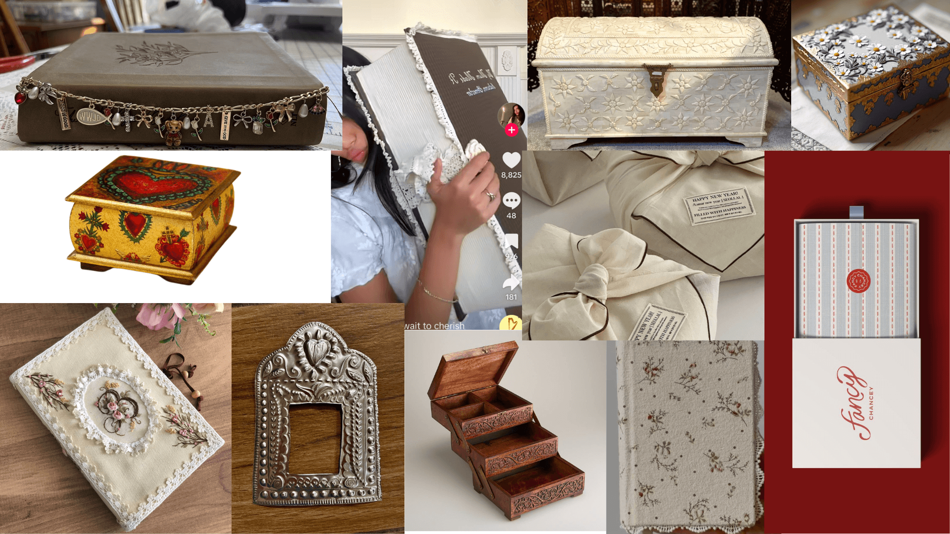
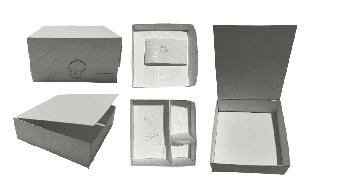
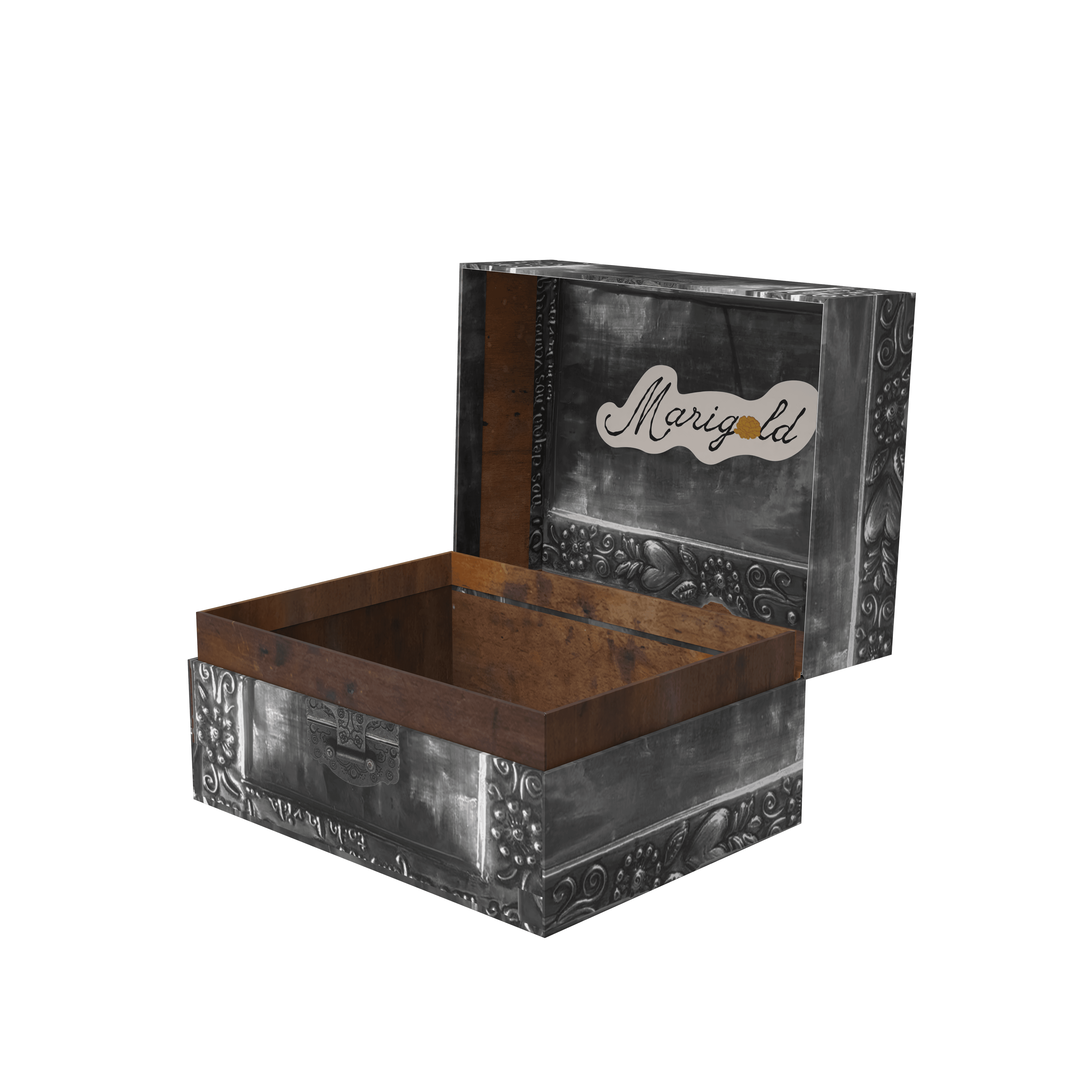
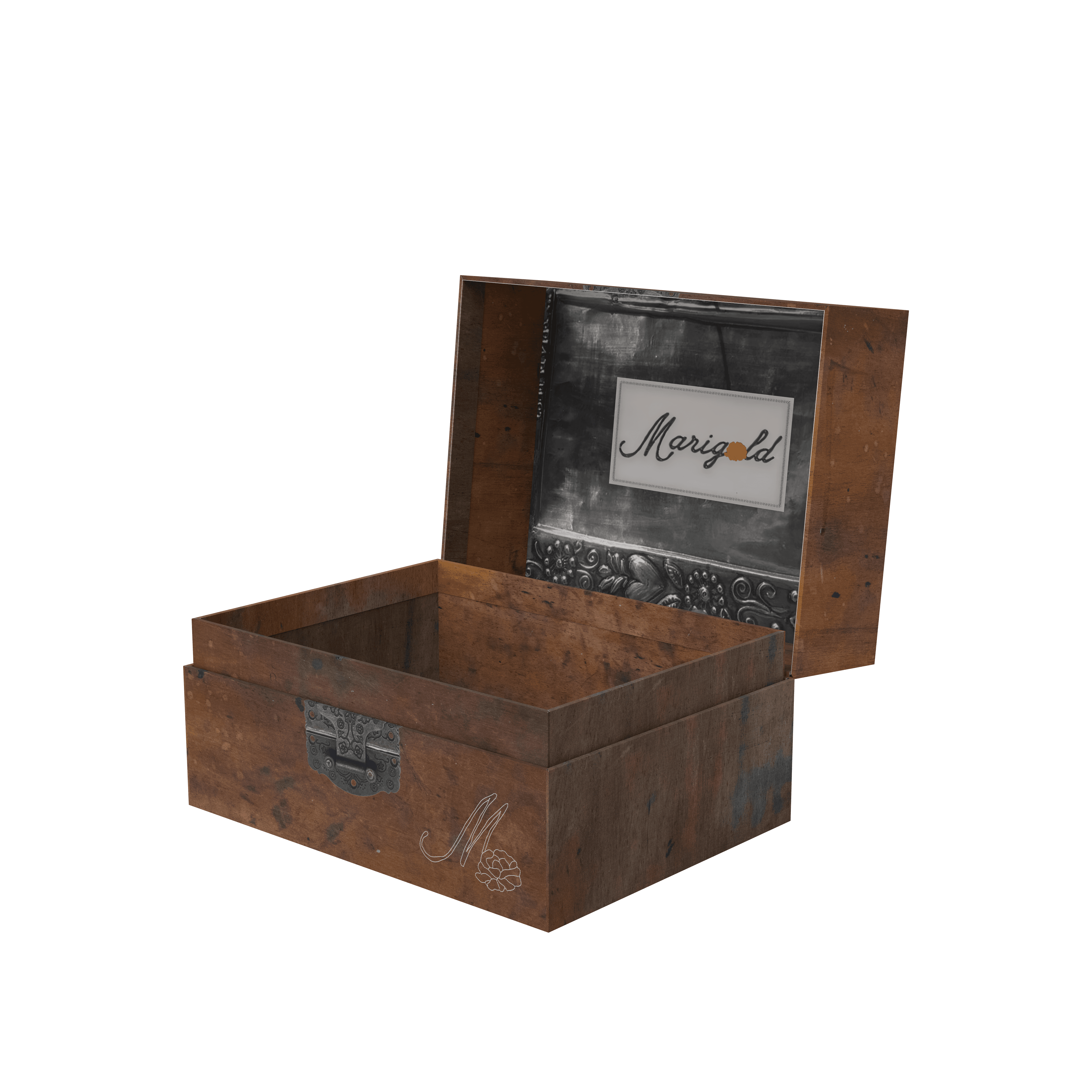
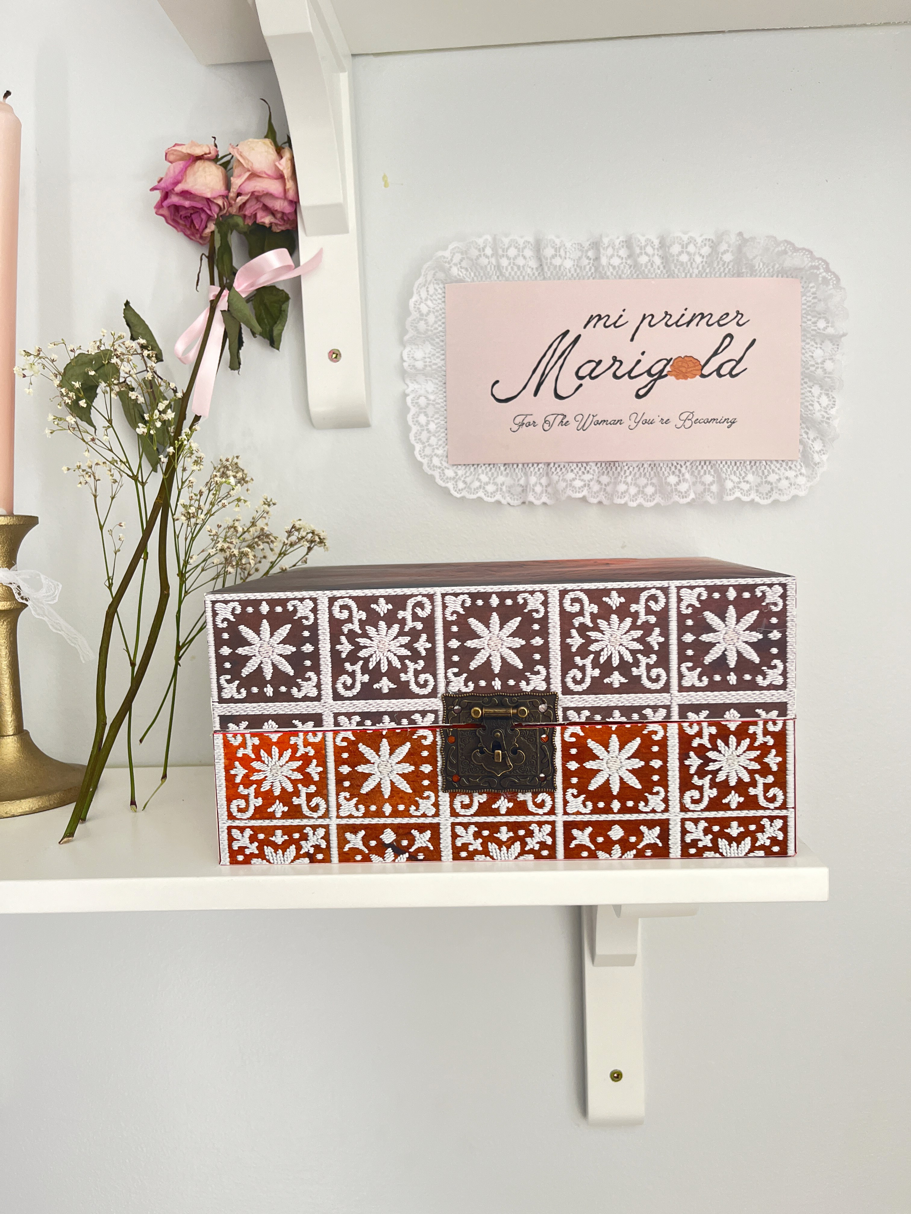
The packaging was designed with sustainability and longevity in mind, with the intention of creating something that wouldn’t simply be thrown away. Instead of traditional packaging, I developed a reusable keepsake box that continues to have value beyond the initial purchase.
Designed for young girls, the box becomes a place to store meaningful items as they grow—turning it into something personal that evolves over time. This approach allows the packaging to feel more intentional and connected to the user’s experience.
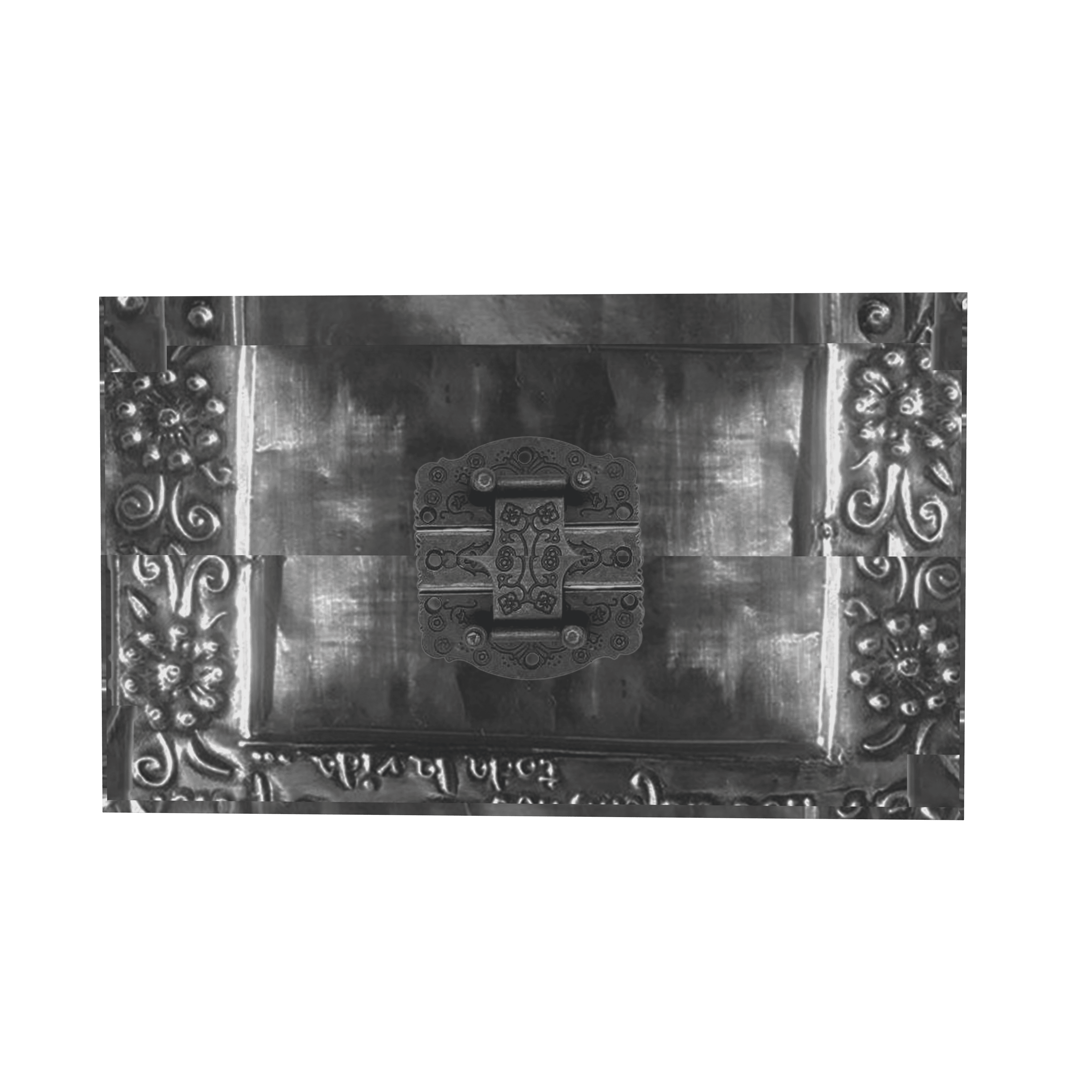
The design is inspired by antique, rustic Mexican chests, bringing in a sense of warmth, history, and craftsmanship. By combining function with sentiment, the packaging becomes more than just a container—it becomes something worth holding onto.
Paper Package Mockups
Digital Package Mockups
Finalized Packaging
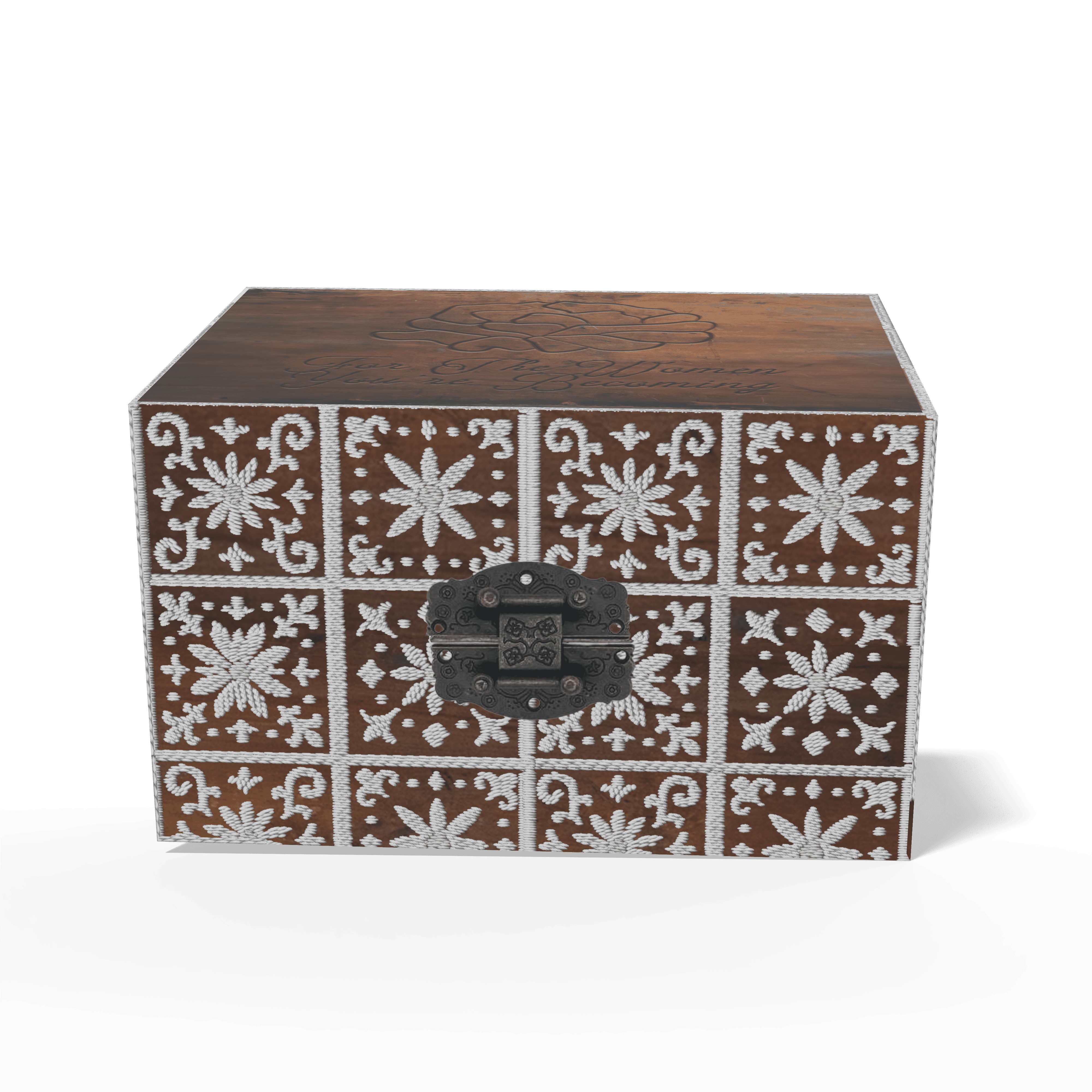
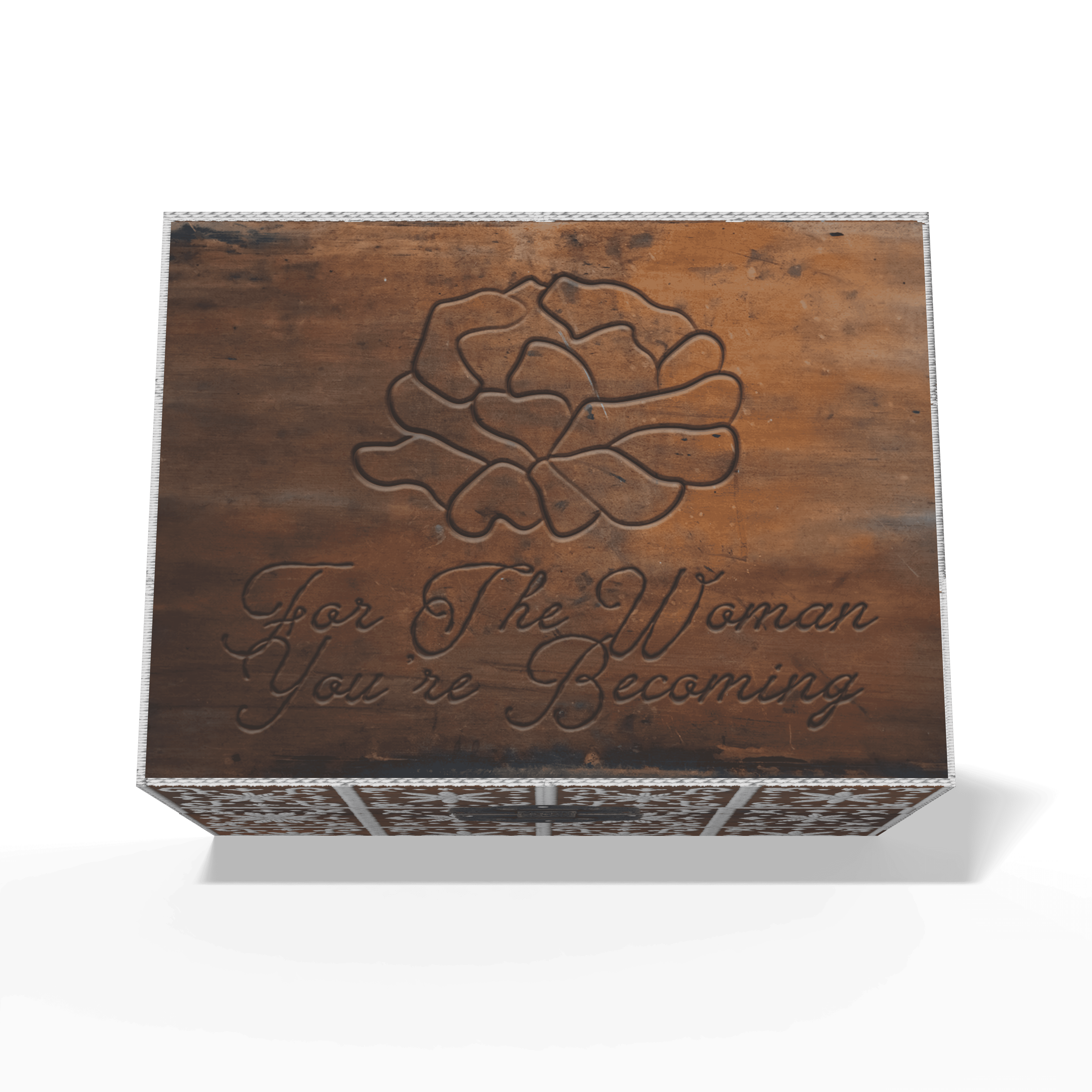
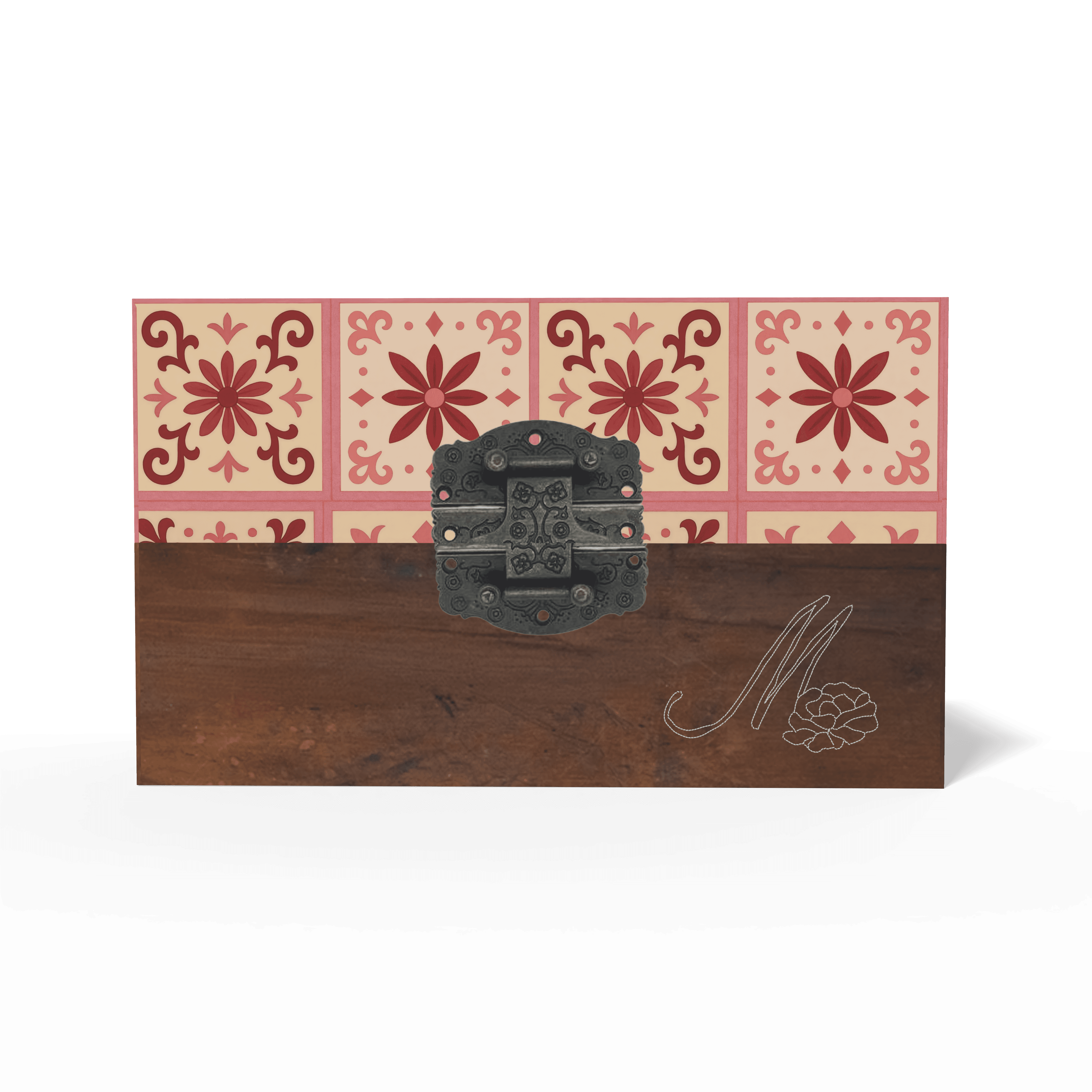
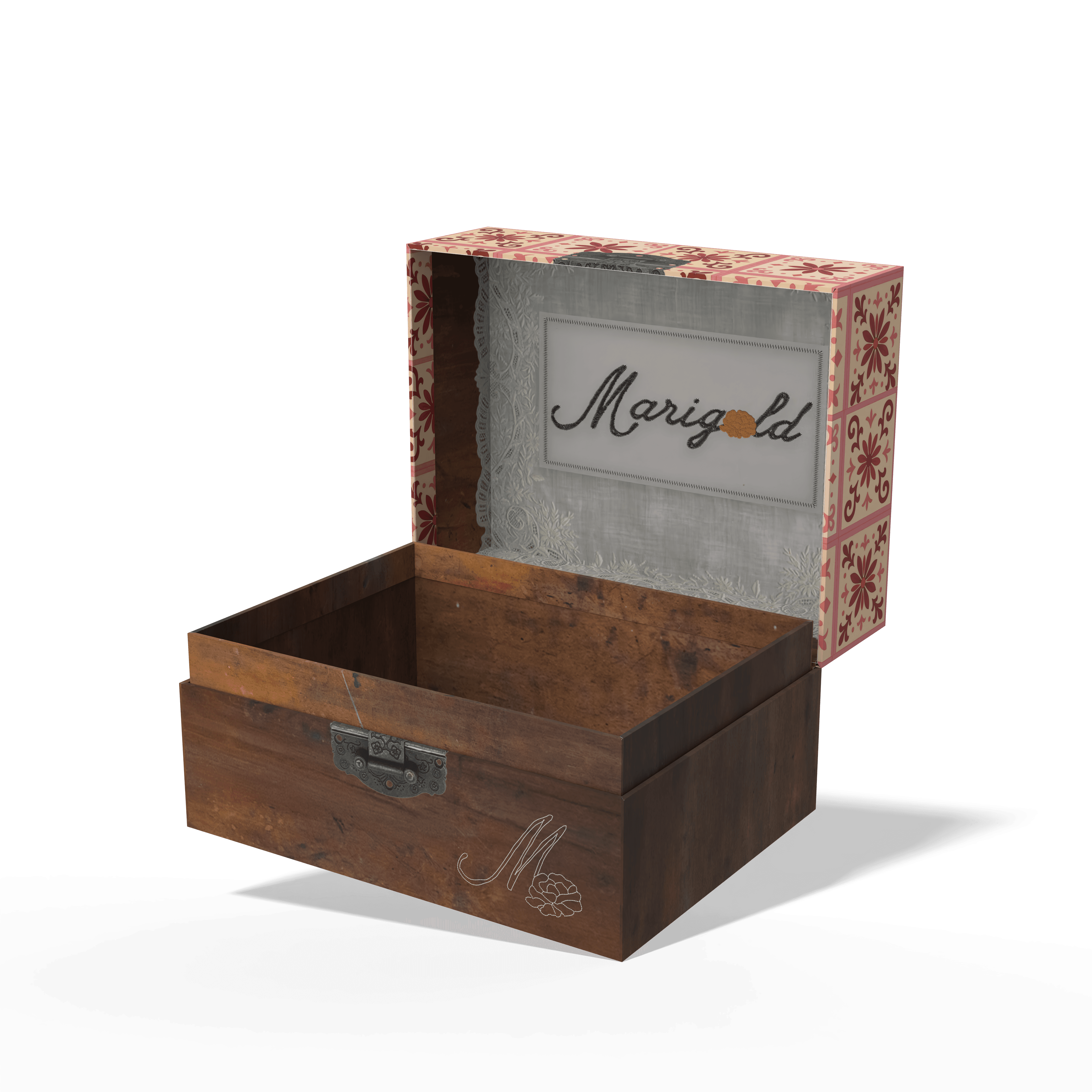
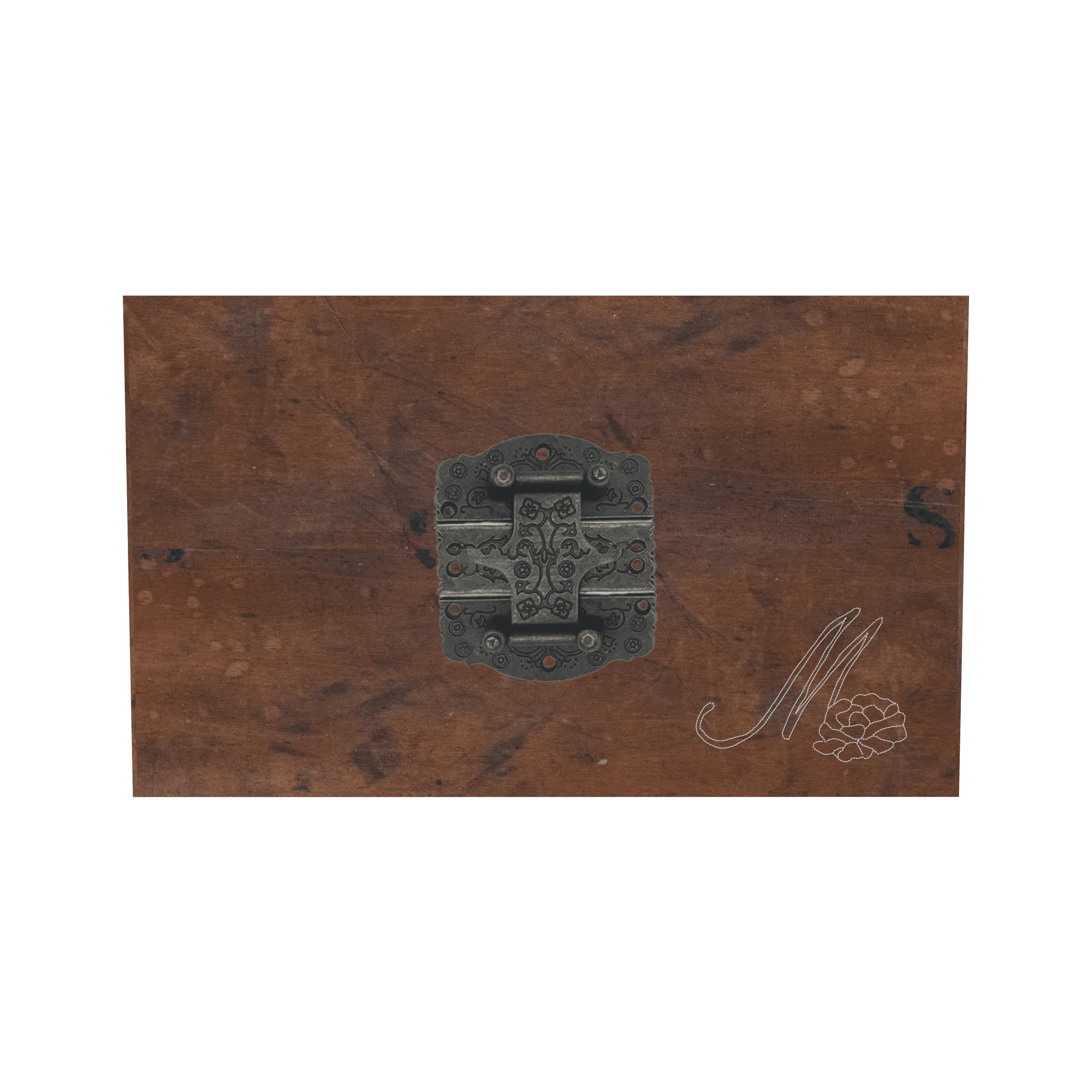
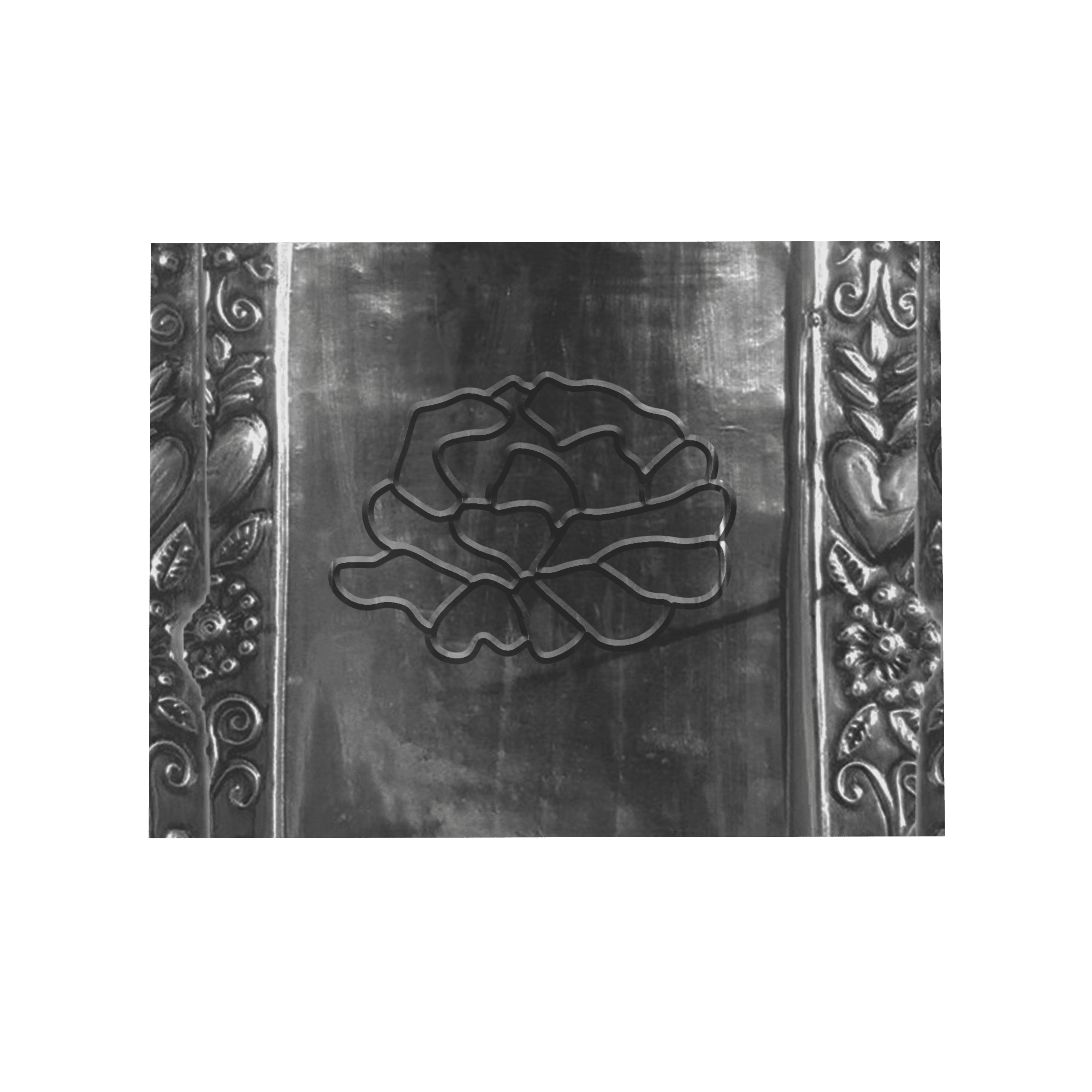
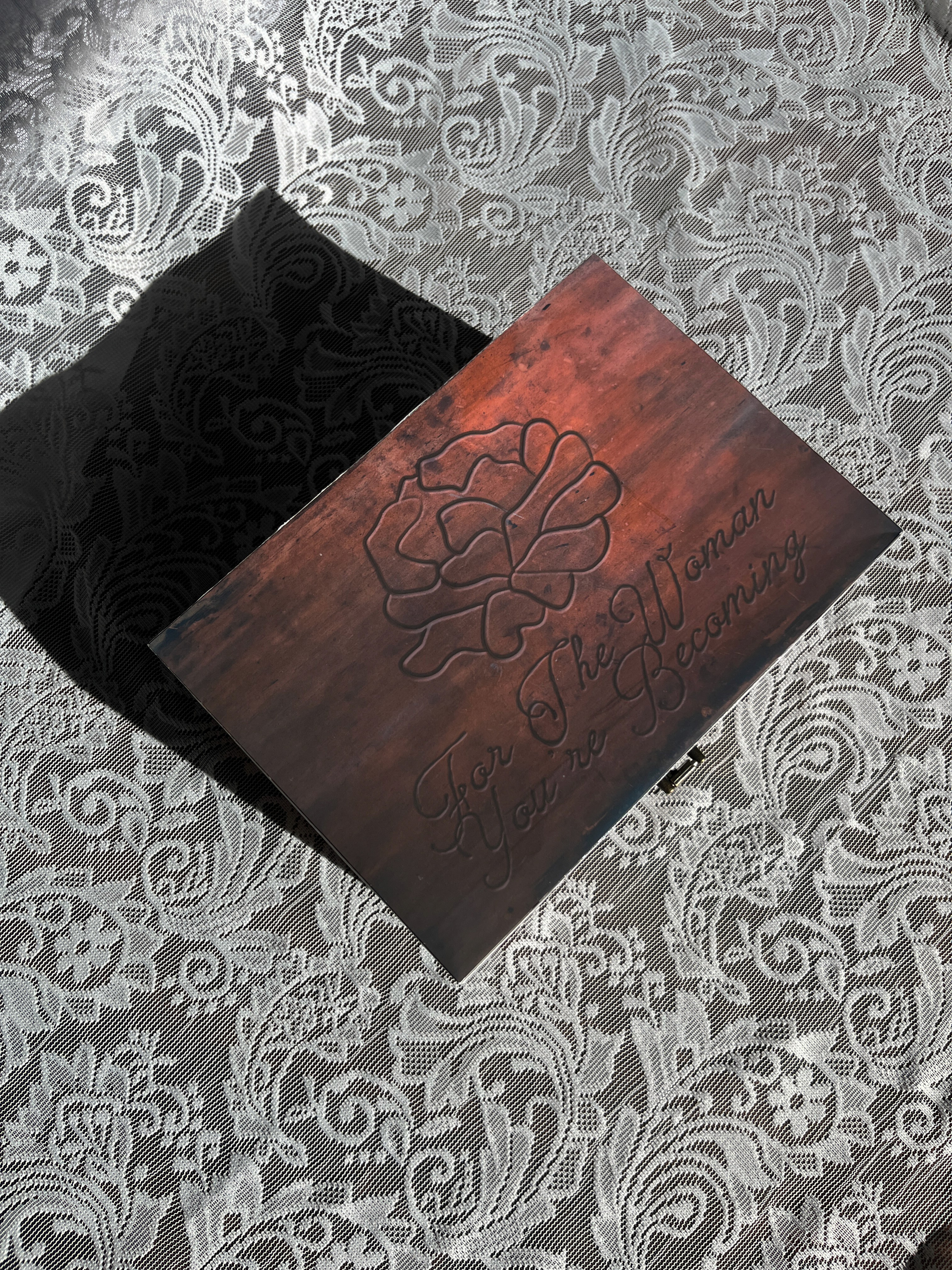
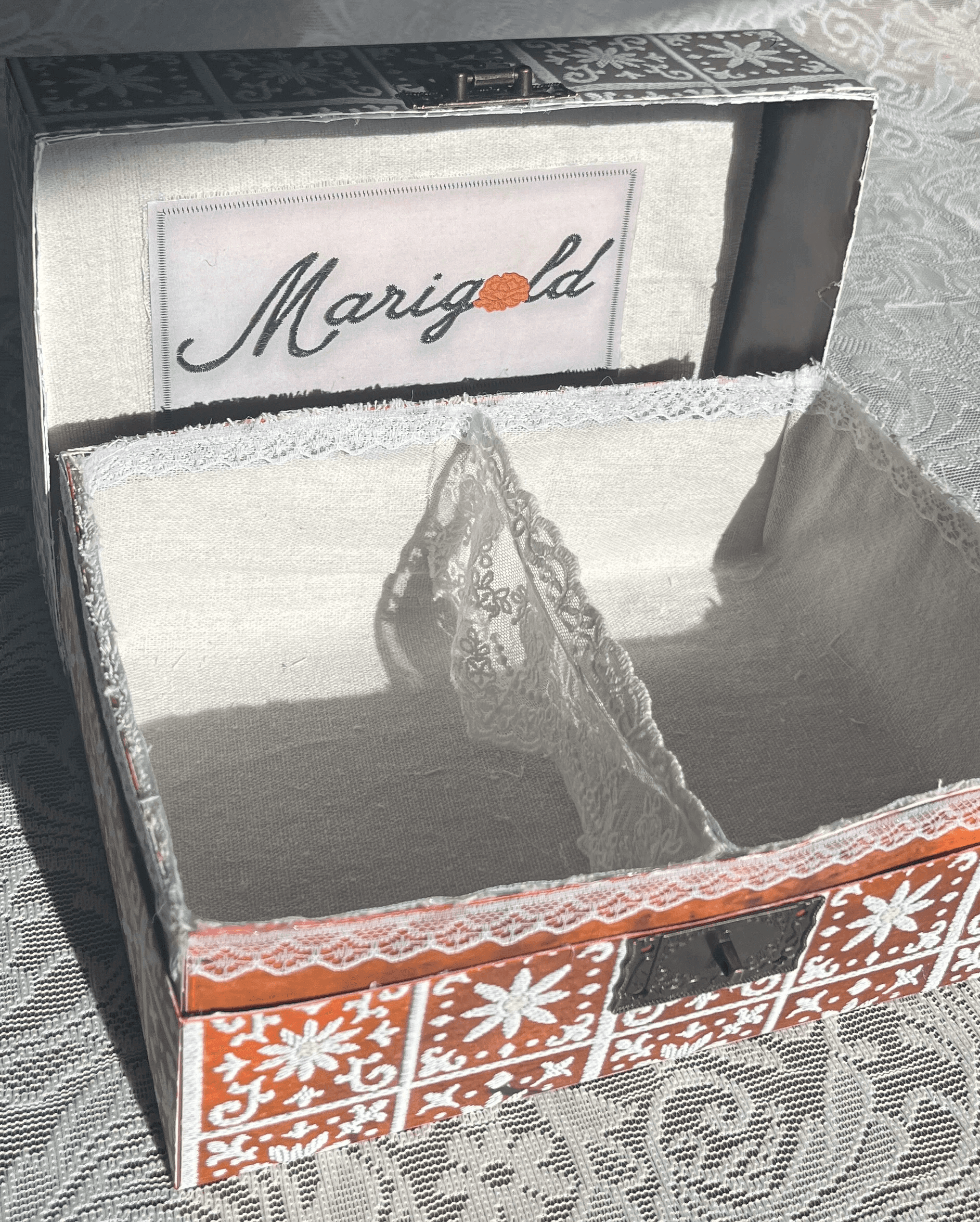
The final packaging embraces a vintage, rustic Mexican aesthetic, drawing from the look and feel of traditional keepsake chests. The Marigold logo is placed at the top alongside the phrase “for the woman you’re becoming,” keeping the branding subtle so the piece feels more personal—like something meant to be held onto rather than displayed.
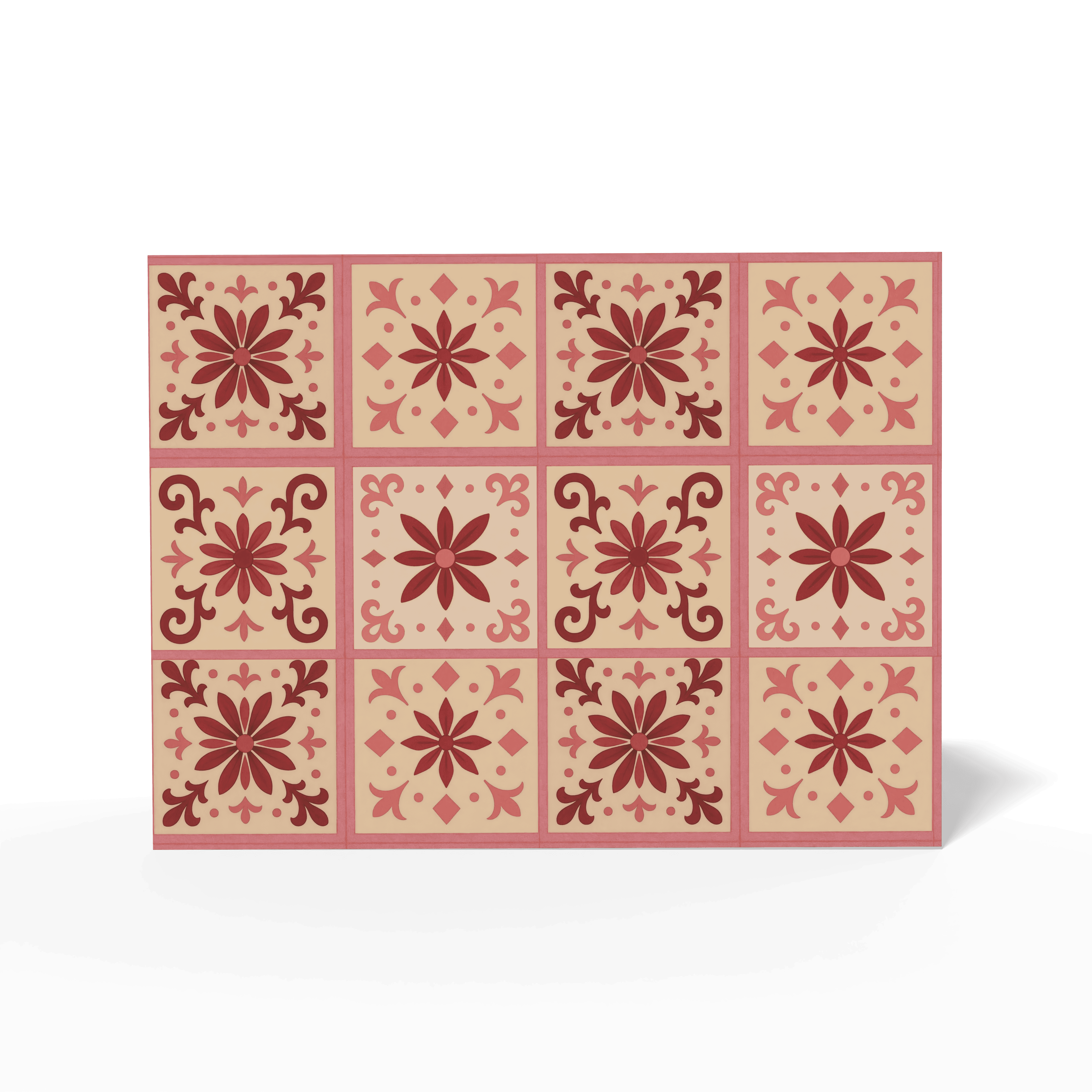
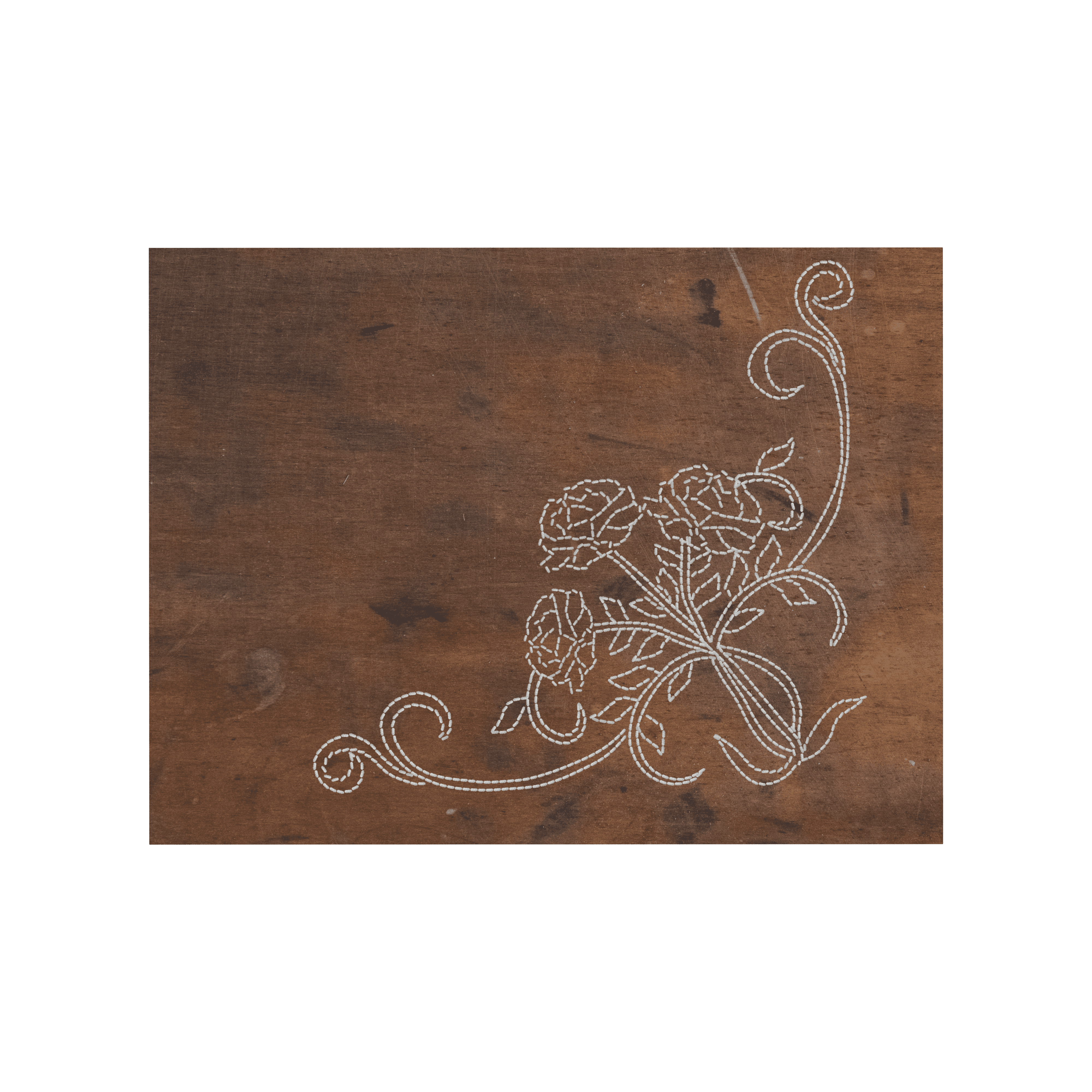
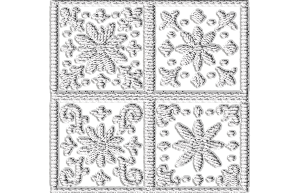
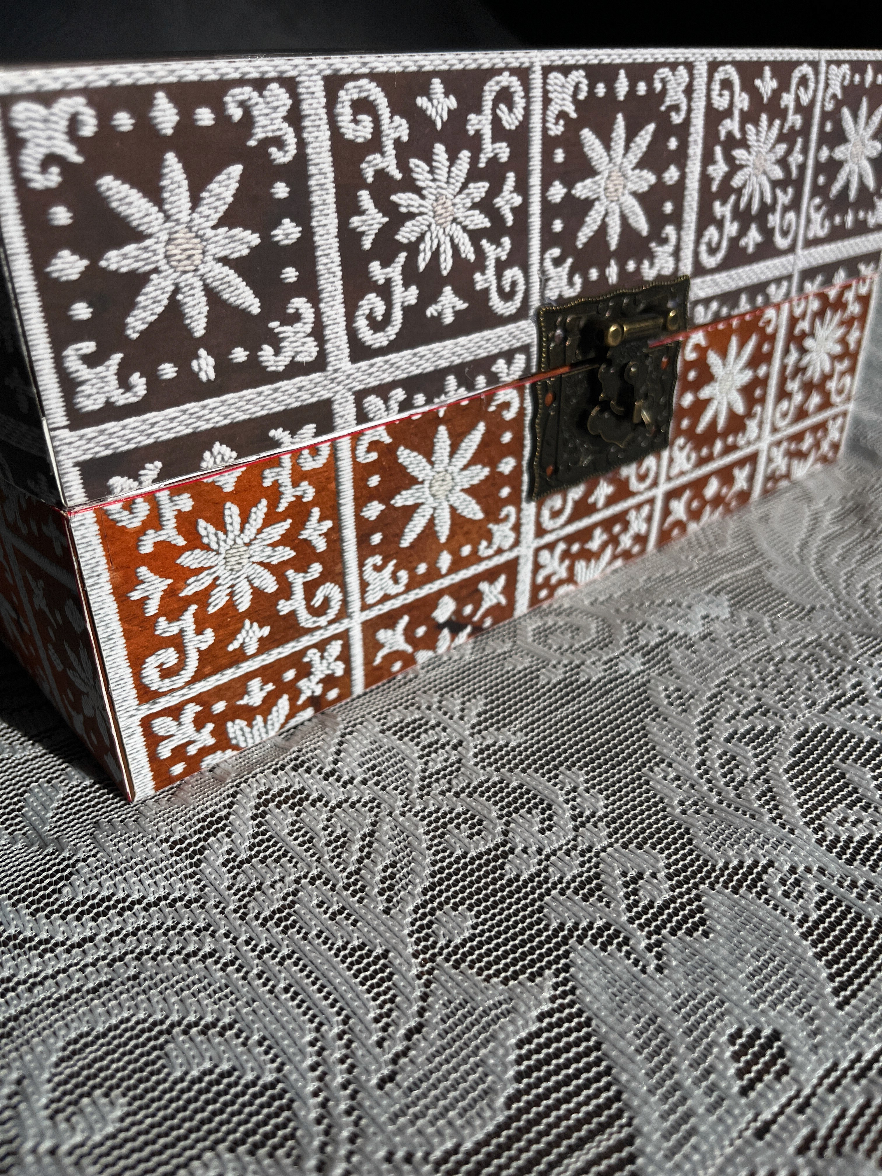
Stitched, tile-inspired textile details wrap around the box, referencing traditional patterns and handcrafted embroidery. These elements bring in a sense of history and cultural familiarity, tying the packaging back to the handmade qualities that inspired the collection.
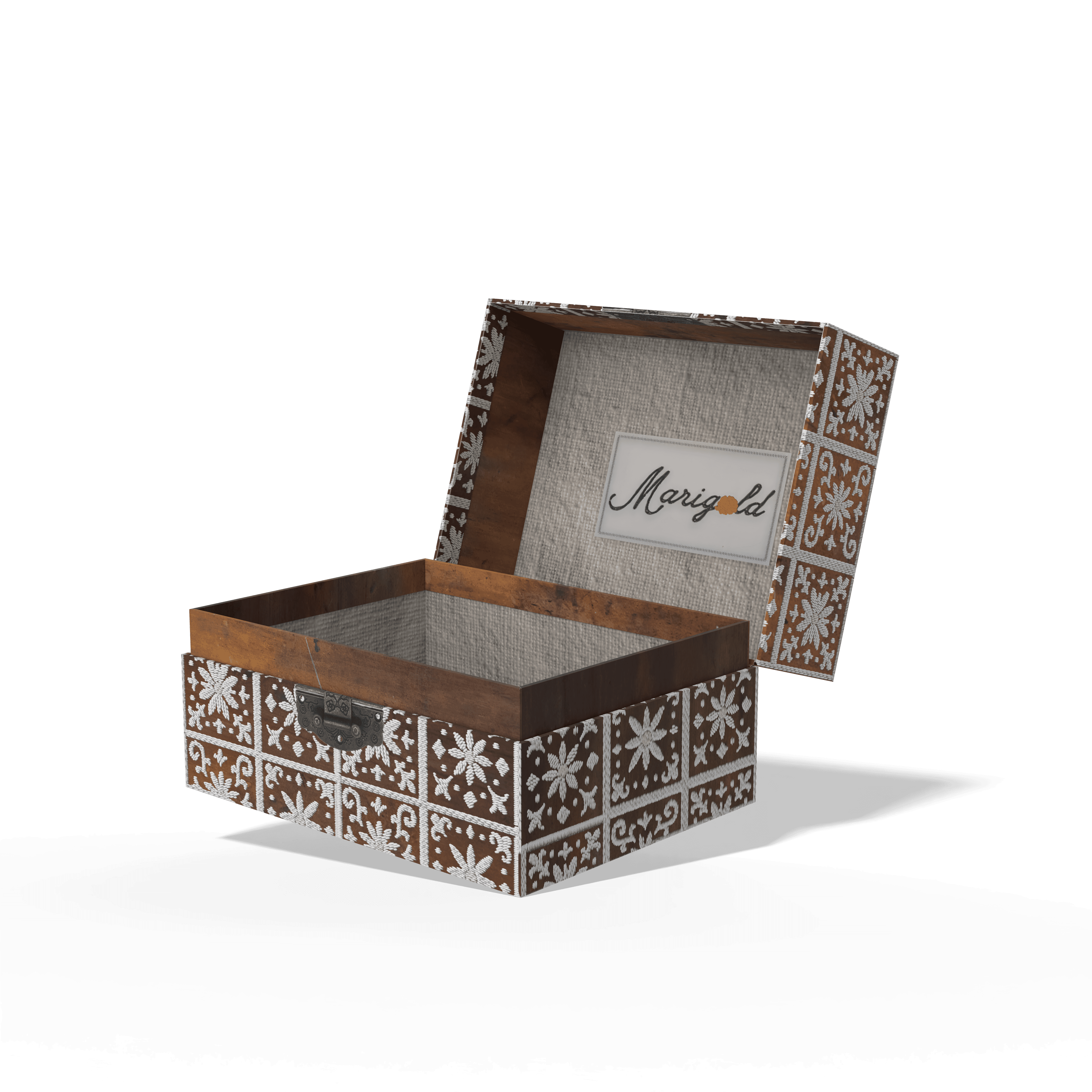
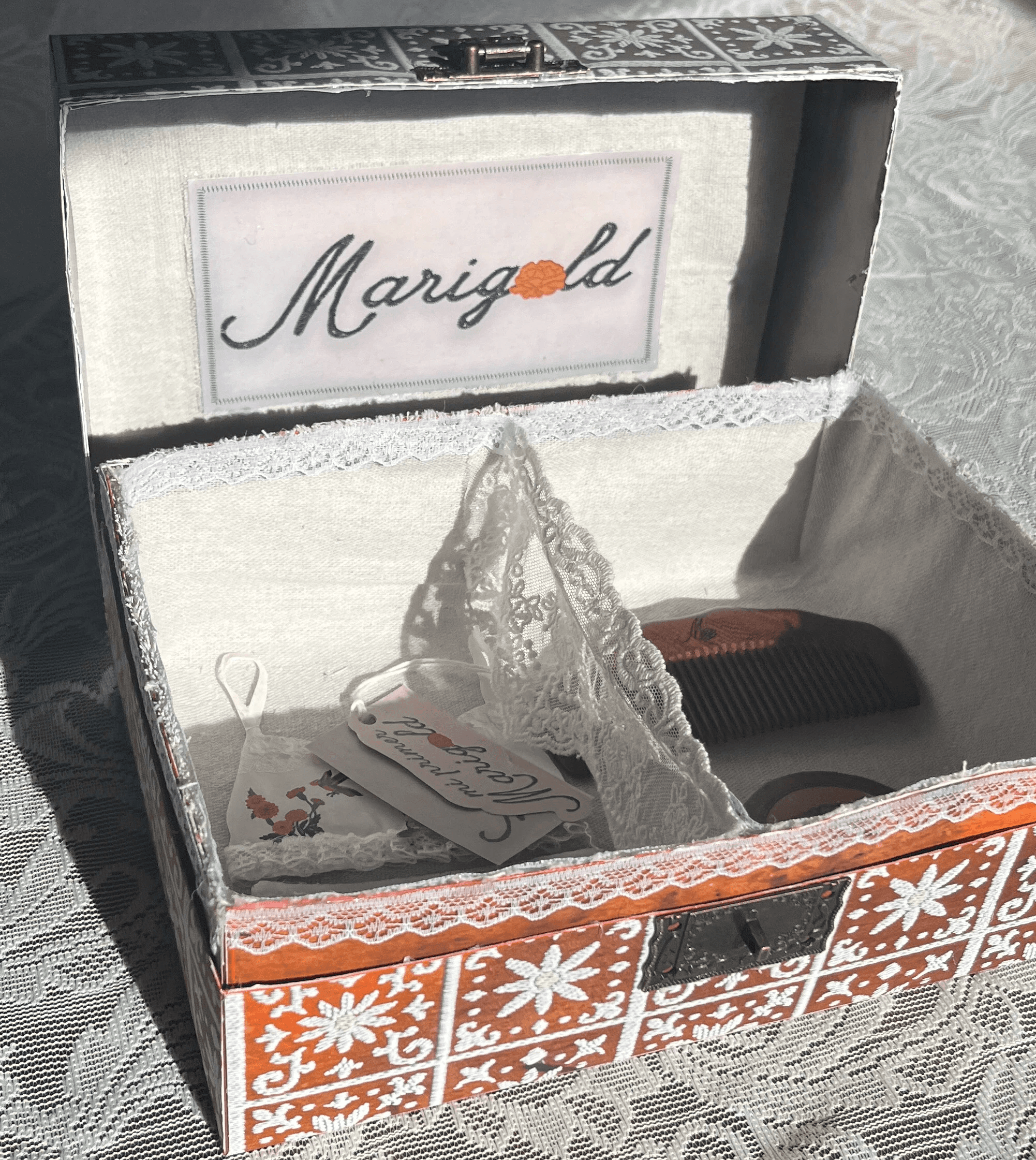
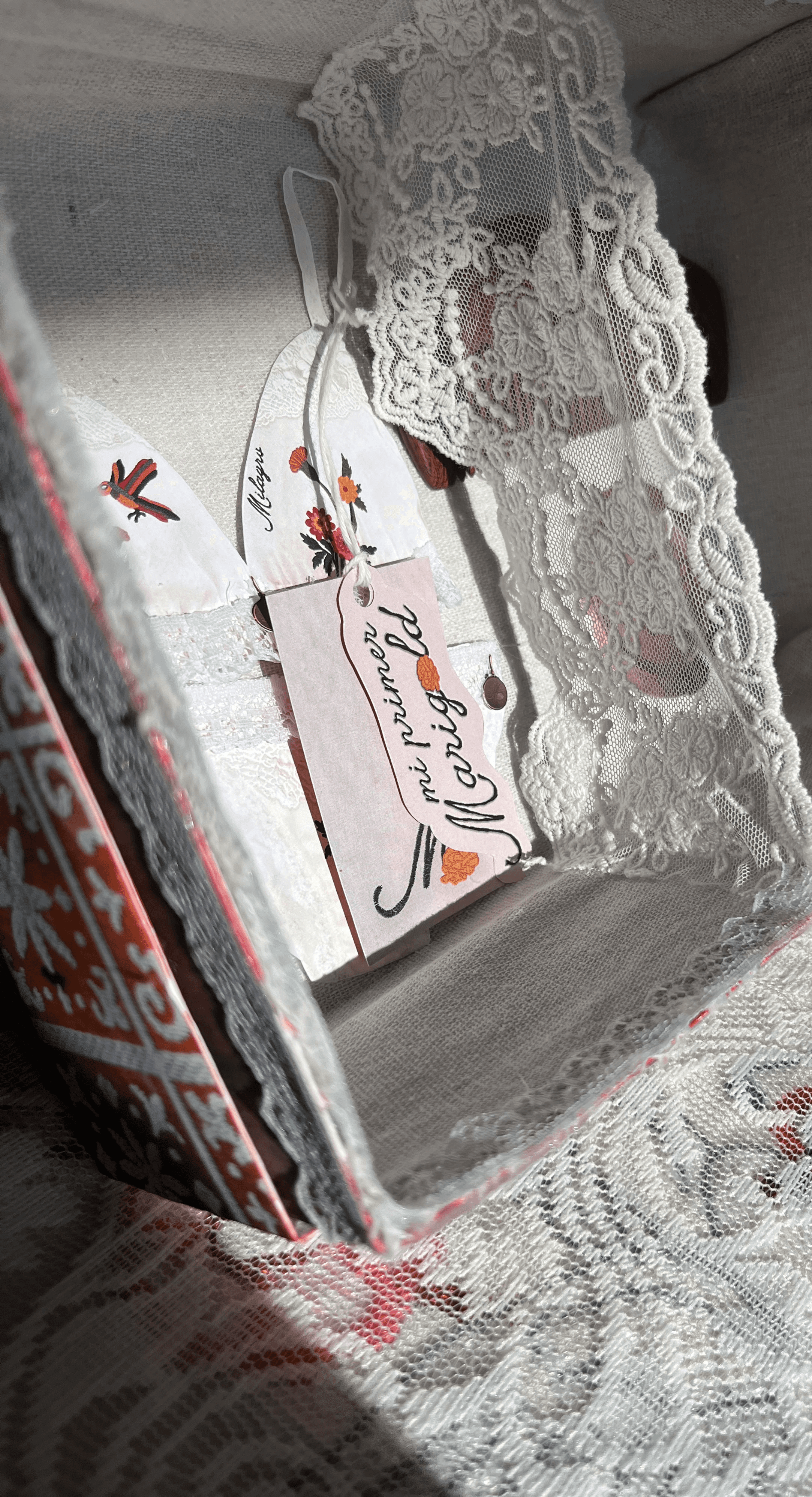
Inside, the contents are wrapped in linen fabric and separated with a lace divider, echoing the soft, worn textures often found in vintage household textiles. This not only adds to the overall aesthetic but also creates a more thoughtful and organized experience, separating the main product from additional pieces while reinforcing a sense of care, tradition, and longevity.
Introducing
Mi Primer Marigold
While the Marigold brand represents womanhood in full bloom, Mi Primer Marigold introduces its first petal. This collection is designed as a gentle entry point for girls aged 9–13, marking an important transition as they begin wearing their first bra.
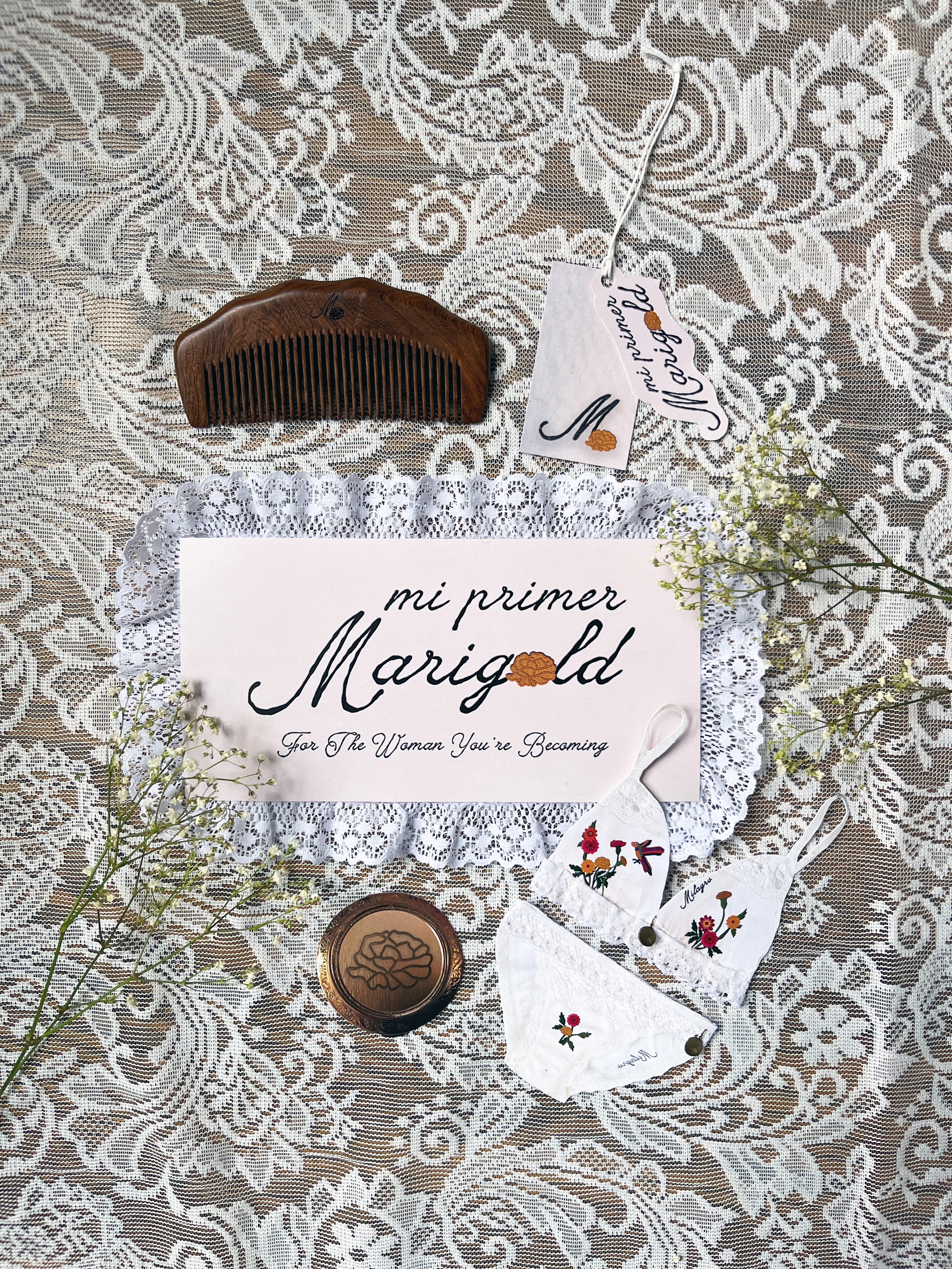
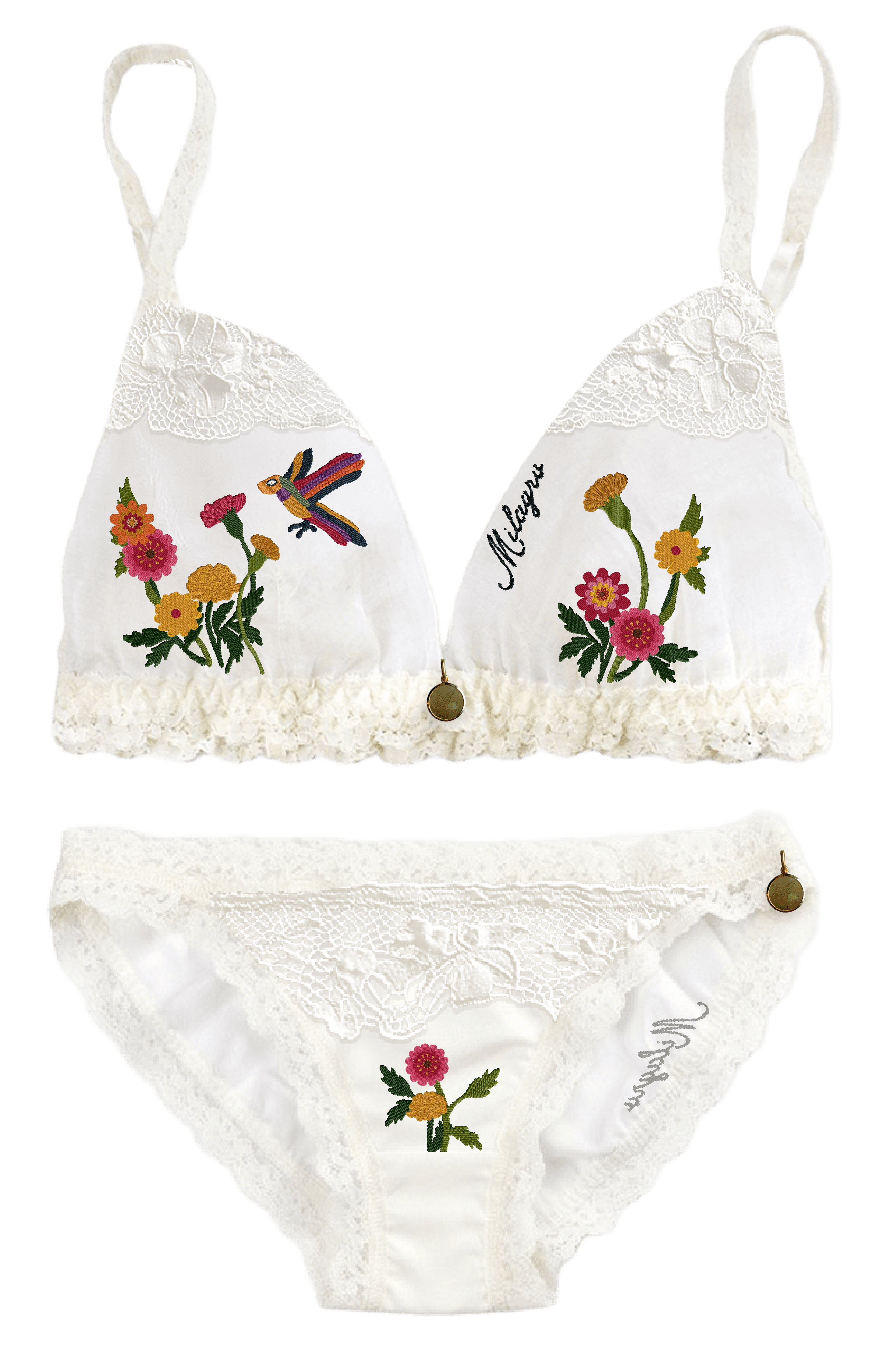
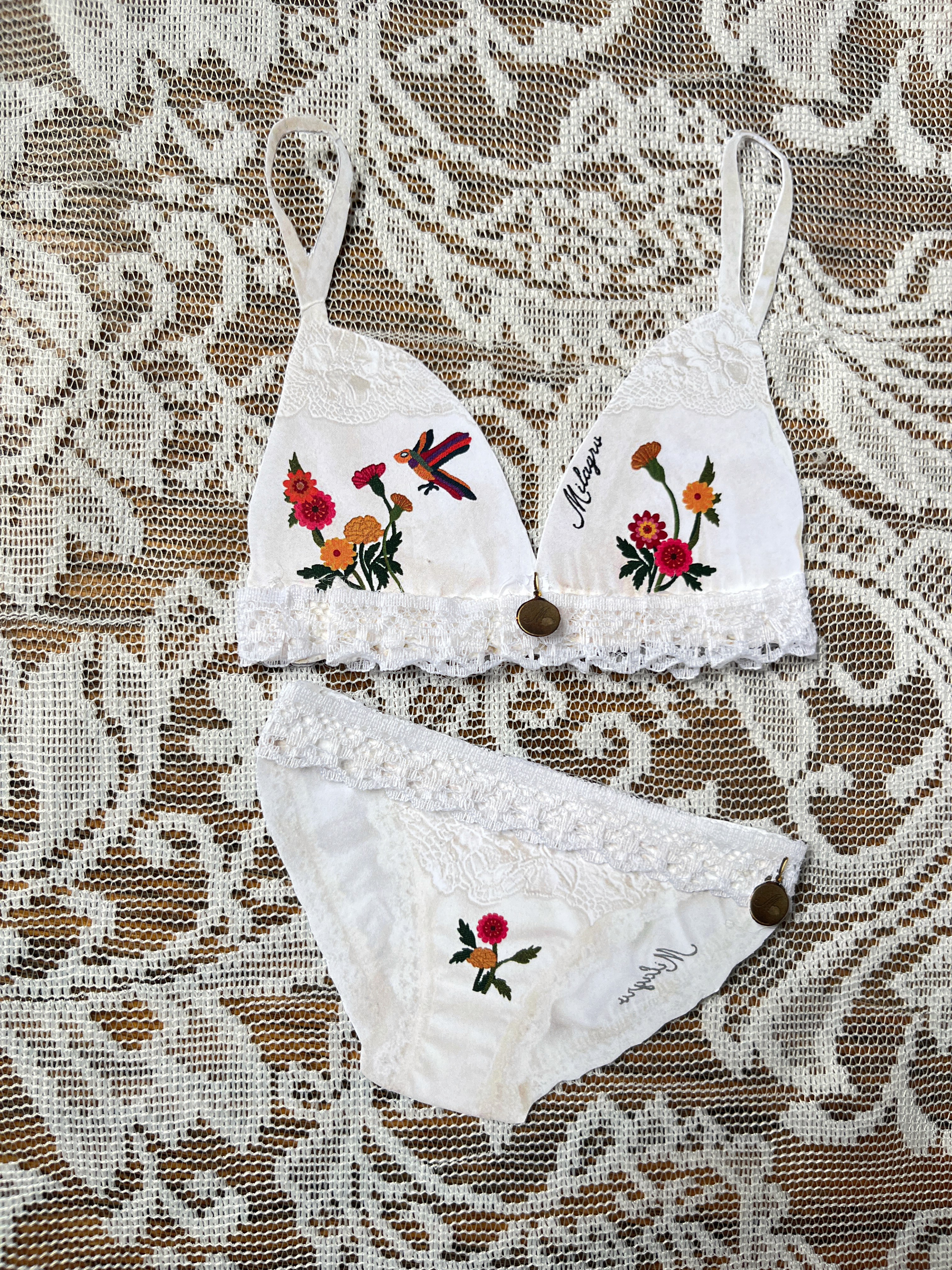
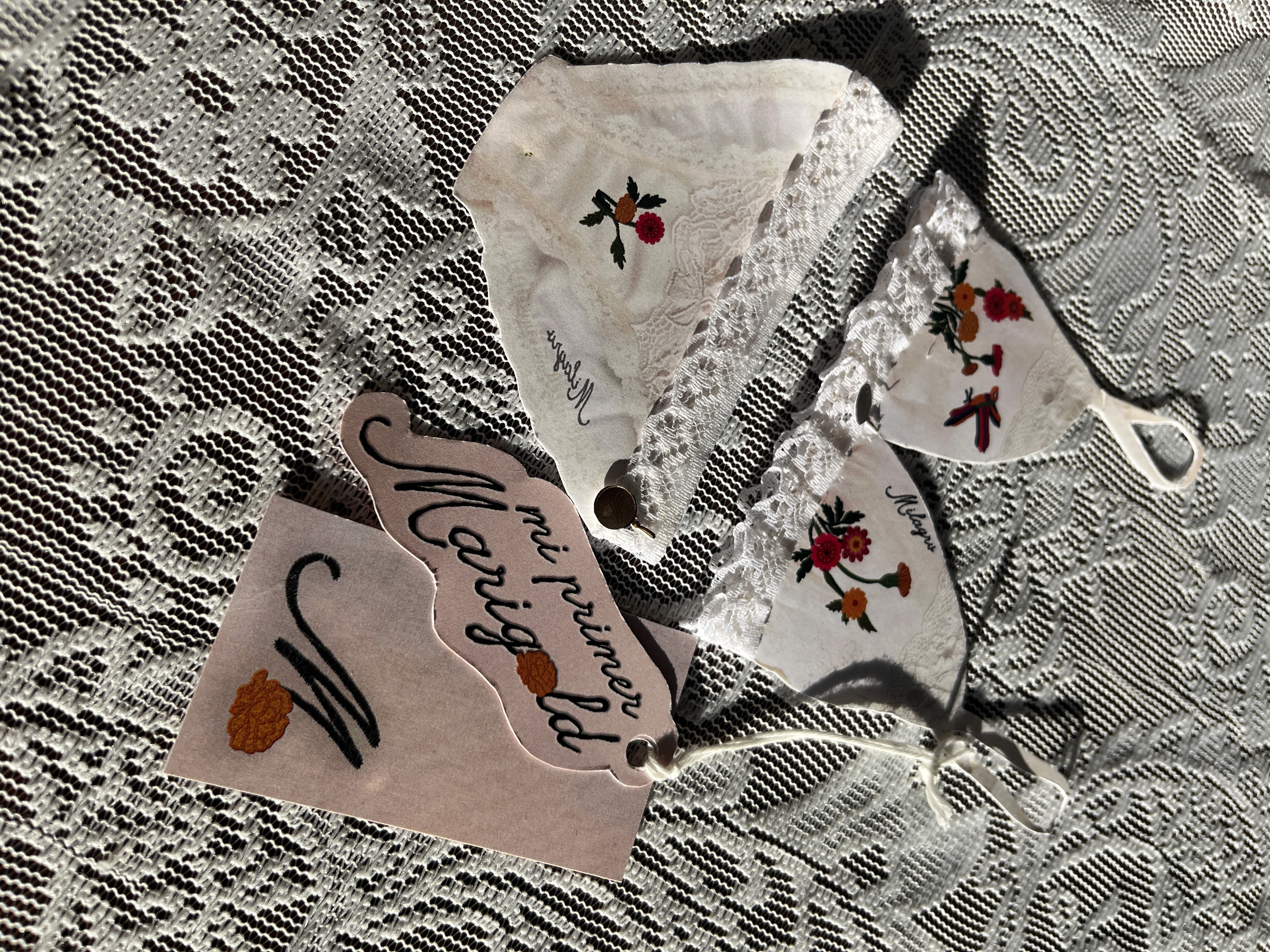
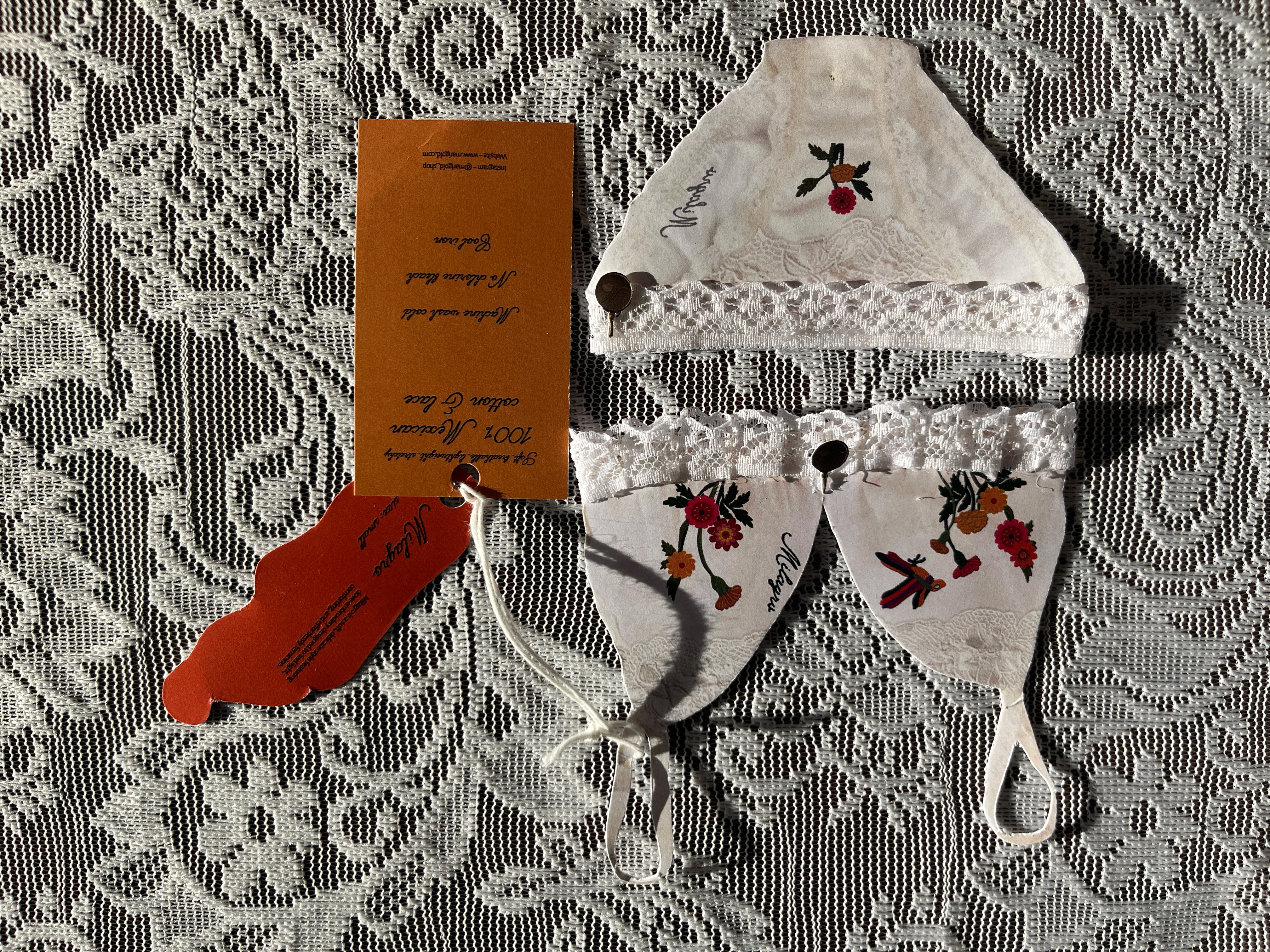
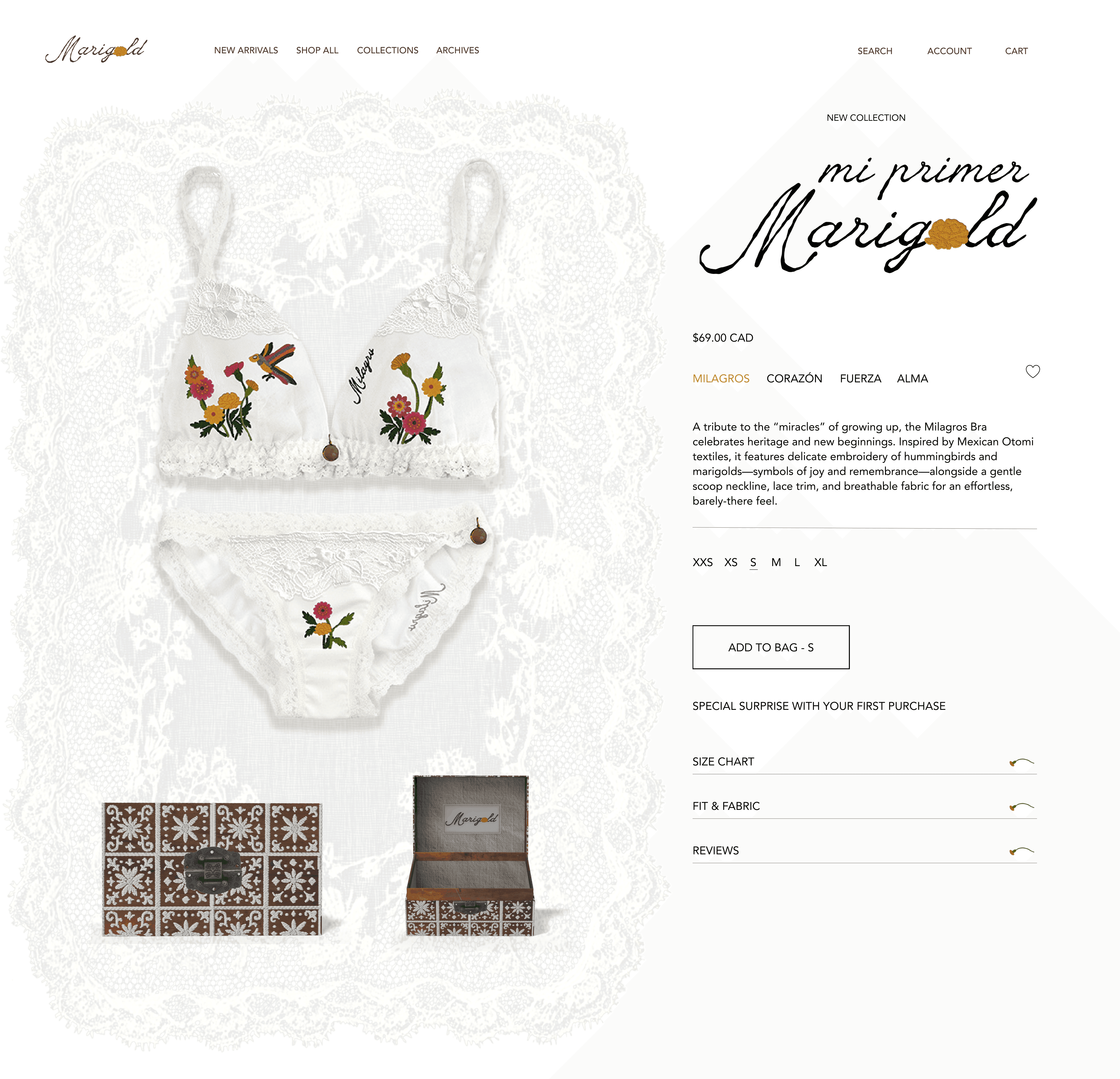
The collection includes a set of bras and underwear (Milagros, Corazón, Fuerza, and Alma) each created to offer a soft, age-appropriate experience. It intentionally moves away from the over-sexualization often seen in this category, instead embracing innocence, comfort, and playfulness.
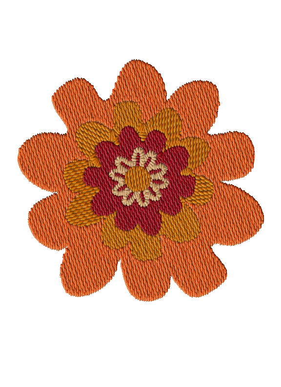
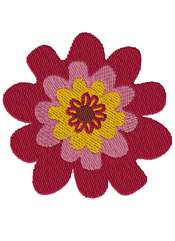
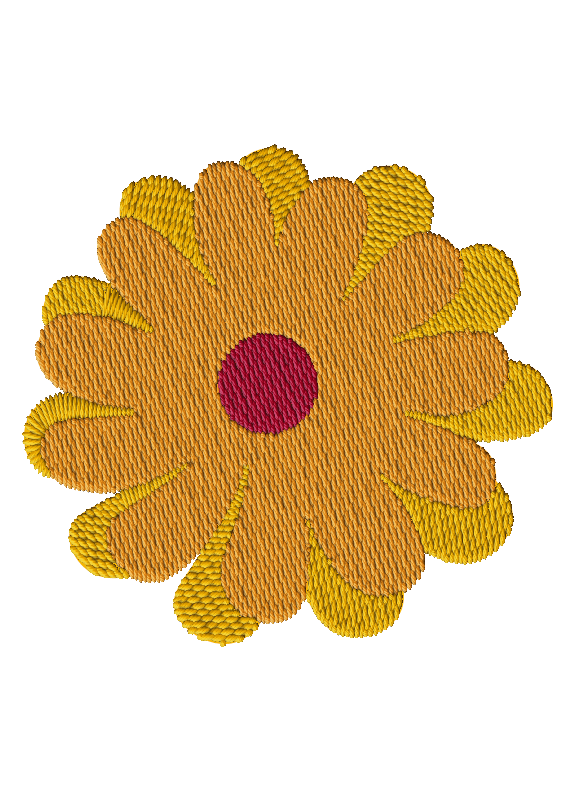
Visually, the designs are lighter and more delicate than the core Marigold line. Elements such as lace, ruffles, and subtle patchwork are combined with traditional Mexican embroidery, maintaining cultural identity while adapting it to a younger audience.
The names of each set reflect qualities of womanhood (magic, heart, strength, and soul) serving as a reminder that these traits already exist within young girls and will continue to grow with them over time.
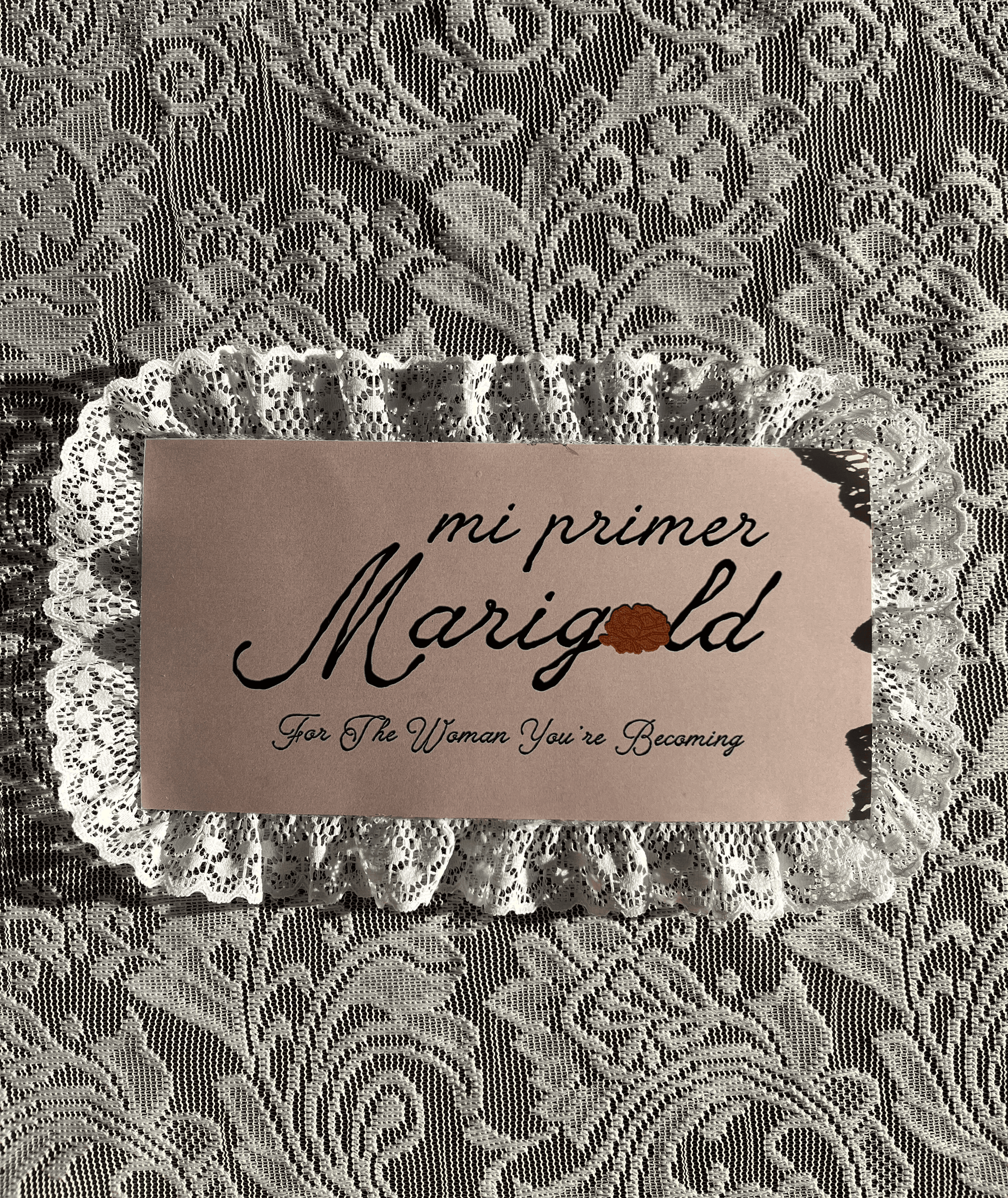
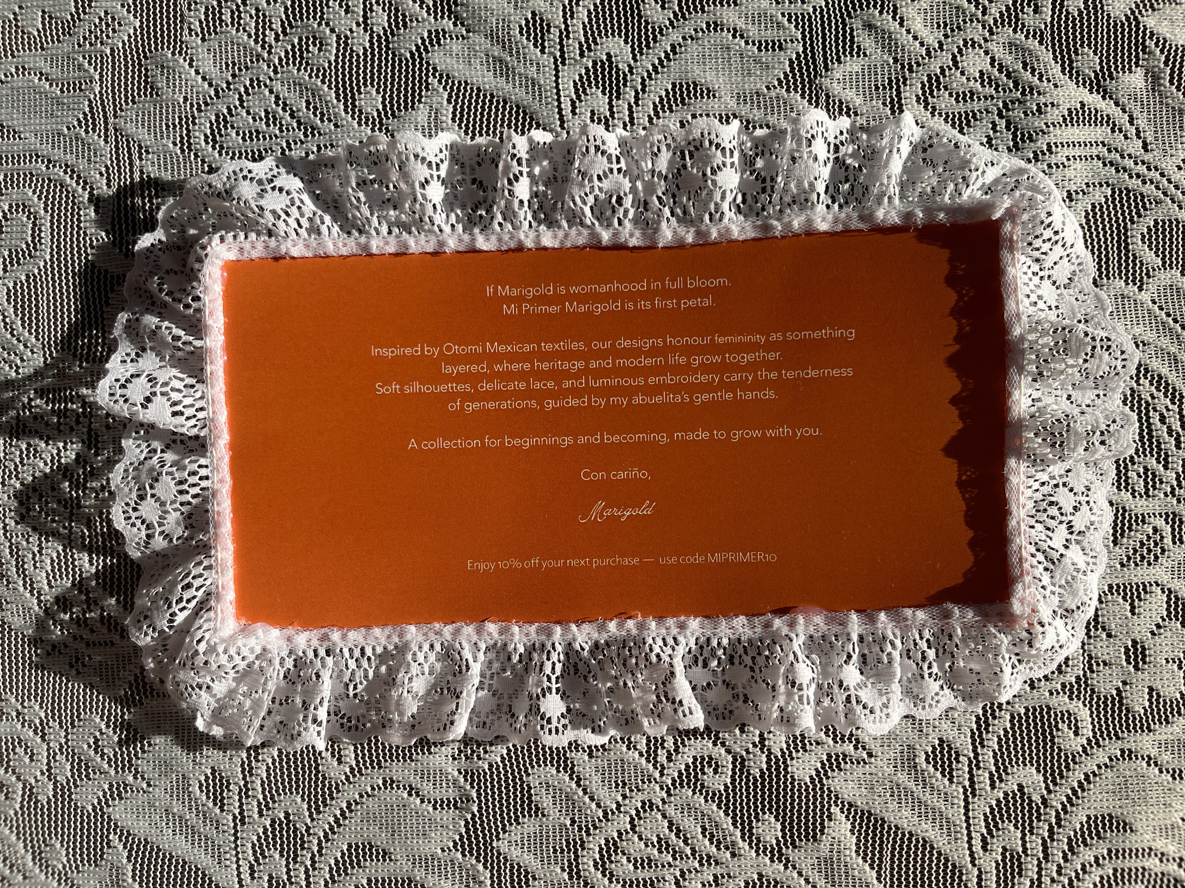
Welcome Note
Milagros Bra
Additionals
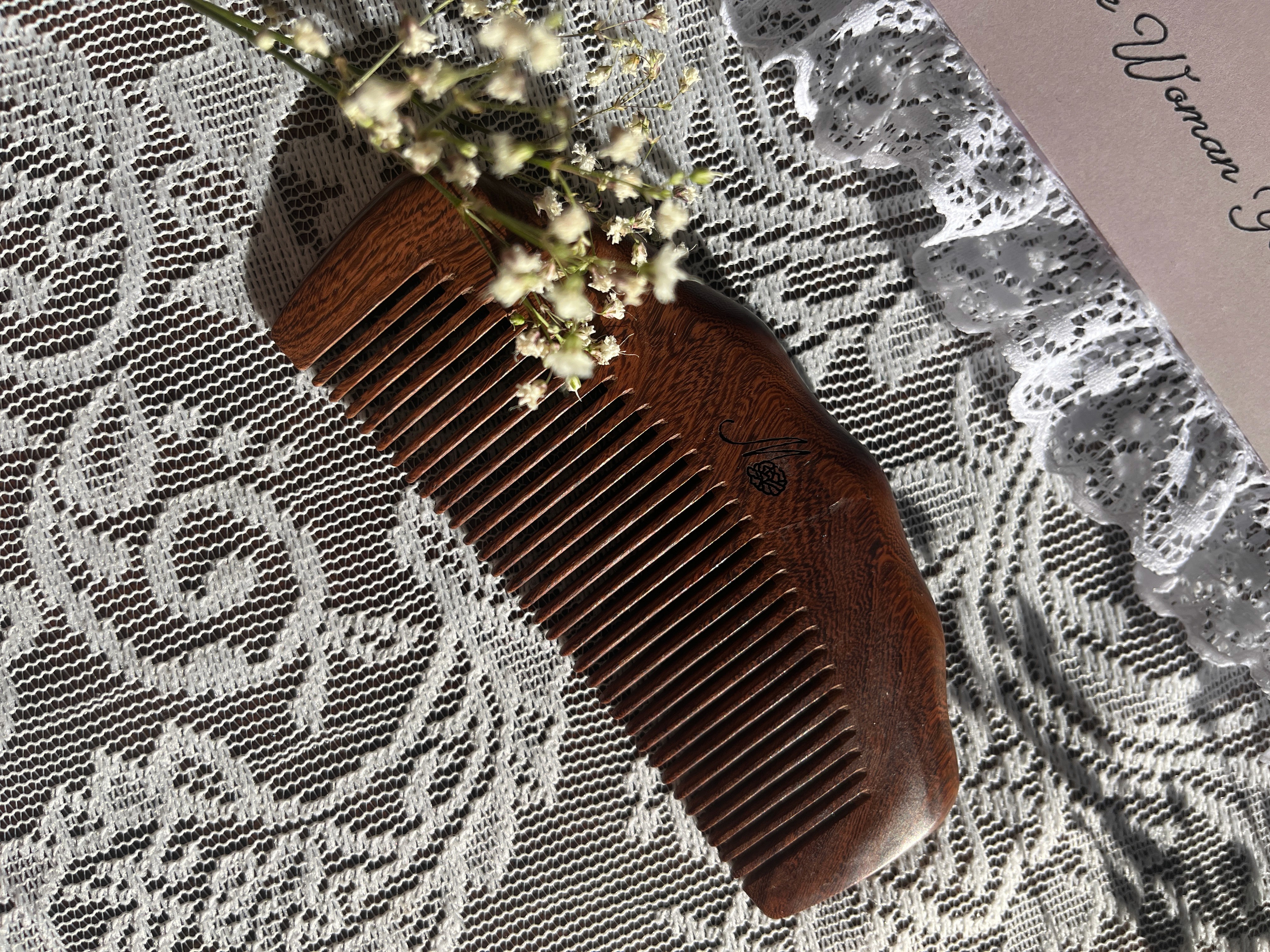
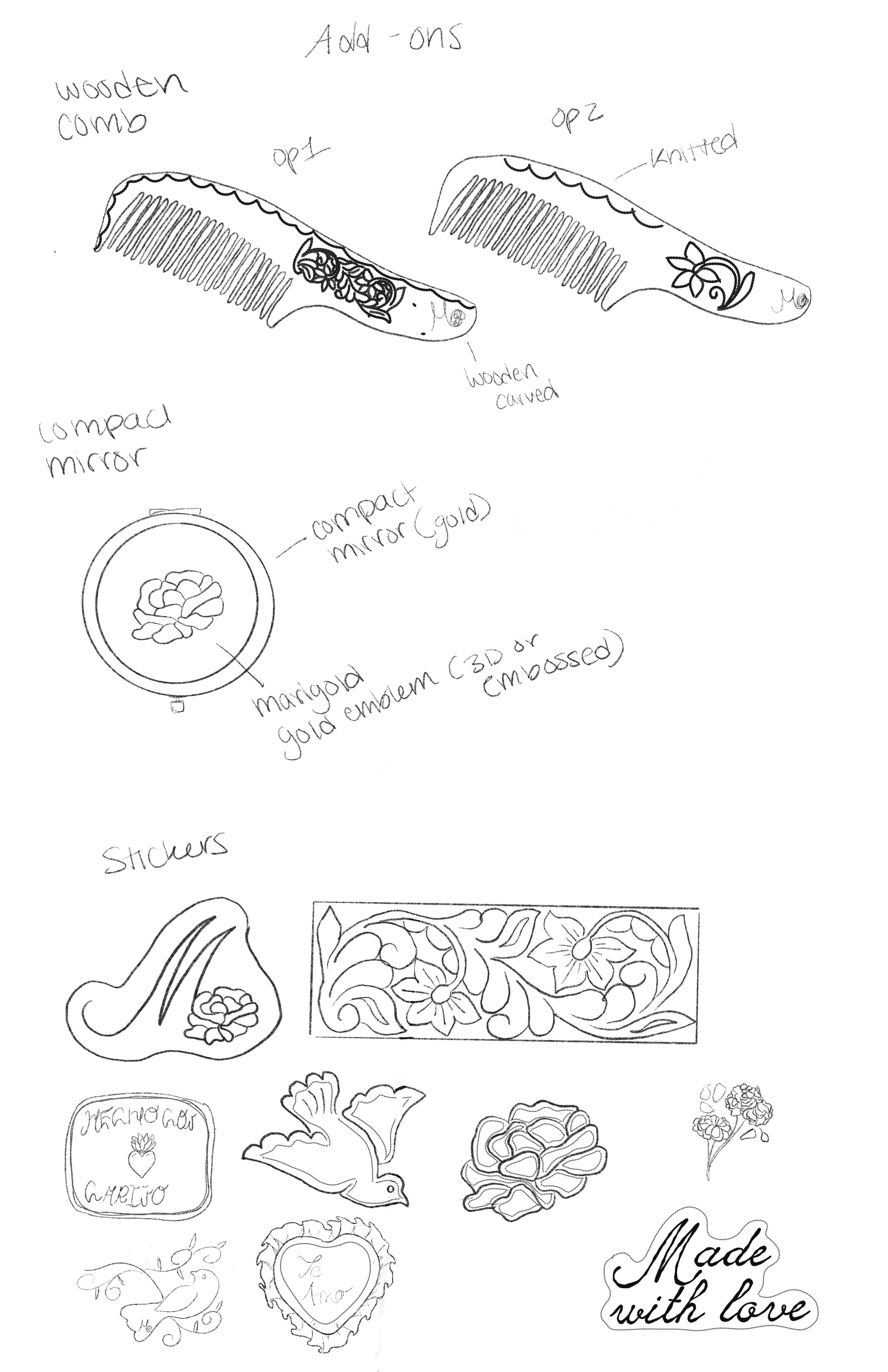
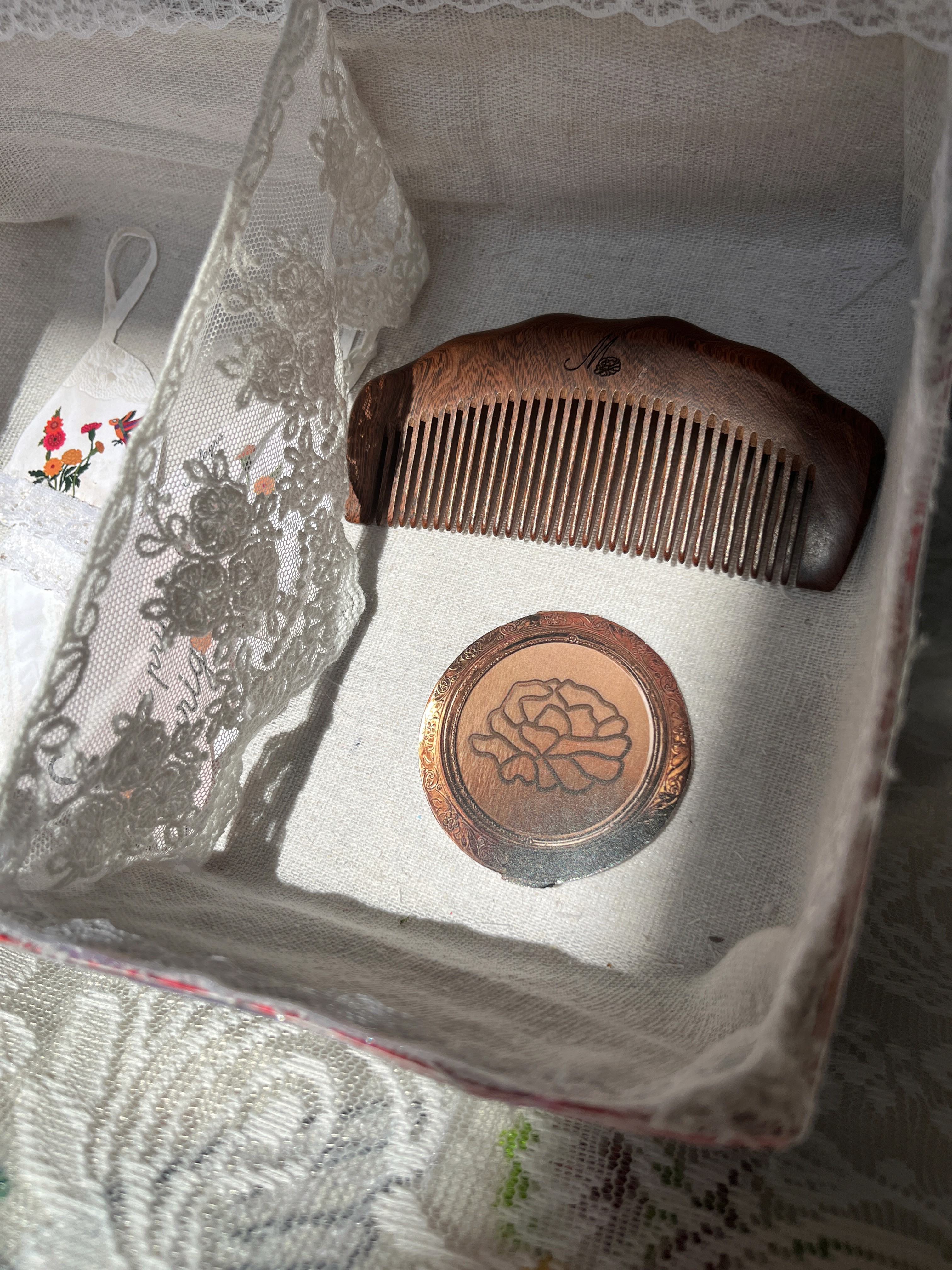
For the additional elements in my Marigold project, I included a vintage wooden comb engraved with the Marigold logo to maintain consistency within the branding. Beyond that, the comb carries cultural meaning, within Mexican households, it’s common for an abuelita or mother to gently comb a young girl’s hair. It becomes a quiet, intimate moment of care, patience, and connection.
By including the comb, it becomes more than just an object—it symbolizes those early experiences of girlhood. For young girls, it’s something familiar and functional, but it also carries a sense of comfort and nostalgia. For others who may not have grown up with that tradition, it introduces the idea that something as simple as combing your hair can hold emotional value and memory.
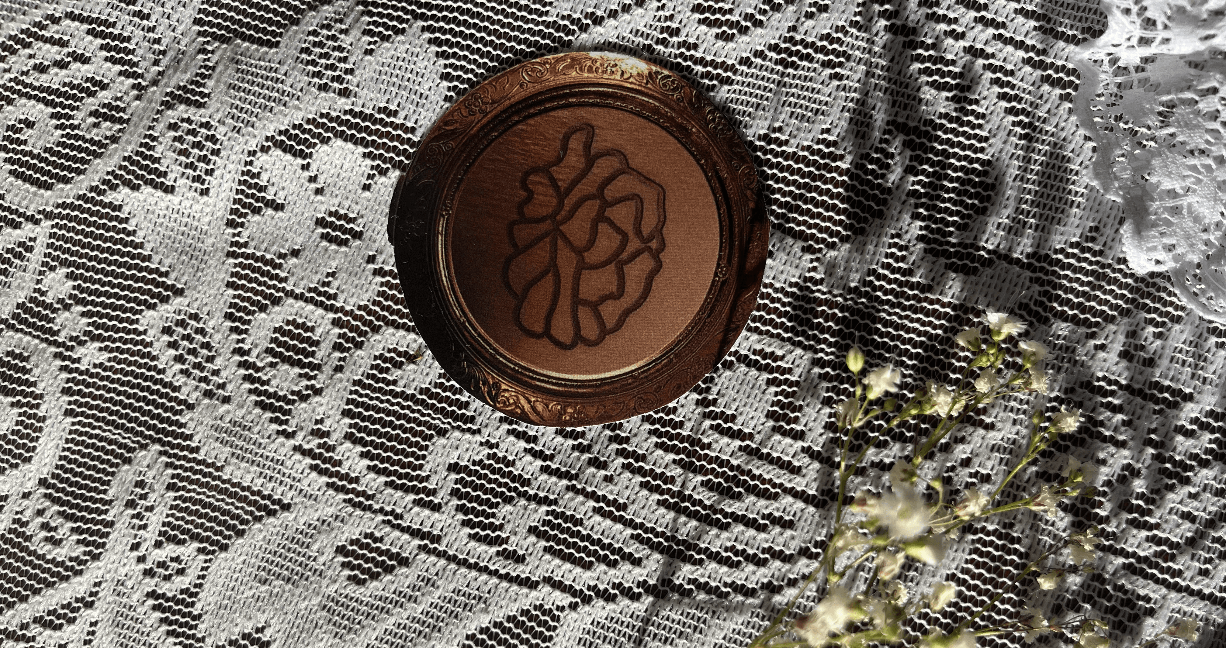
Similarly, the compact mirror is engraved with the Marigold logo and designed with a vintage, antique feel. It reinforces the overall aesthetic of the project, which is rooted in preserving and celebrating vintage elements. The mirror becomes a timeless object, something personal that a young girl can grow with.
Overall, these pieces push back against the idea of fast, disposable modernity. Instead, they highlight objects that are meant to be kept, cherished, and passed down, reminding young girls that value isn’t just in newness, but in meaning, memory, and longevity.
Digitals
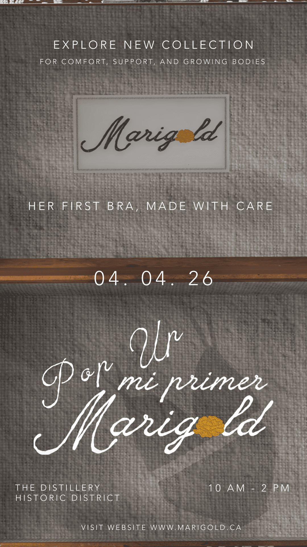
Instagram Stories
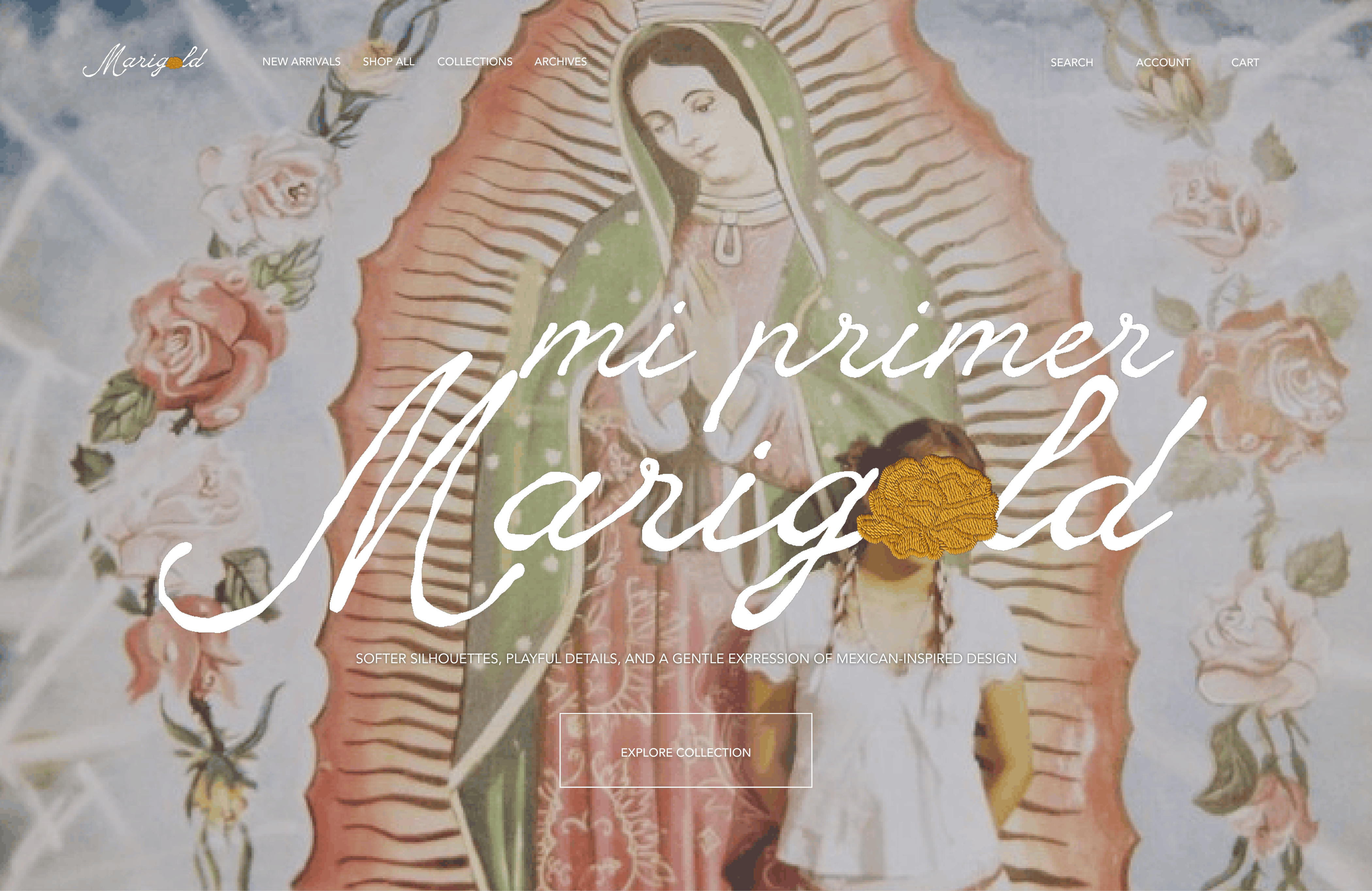
Website
Unboxing Video
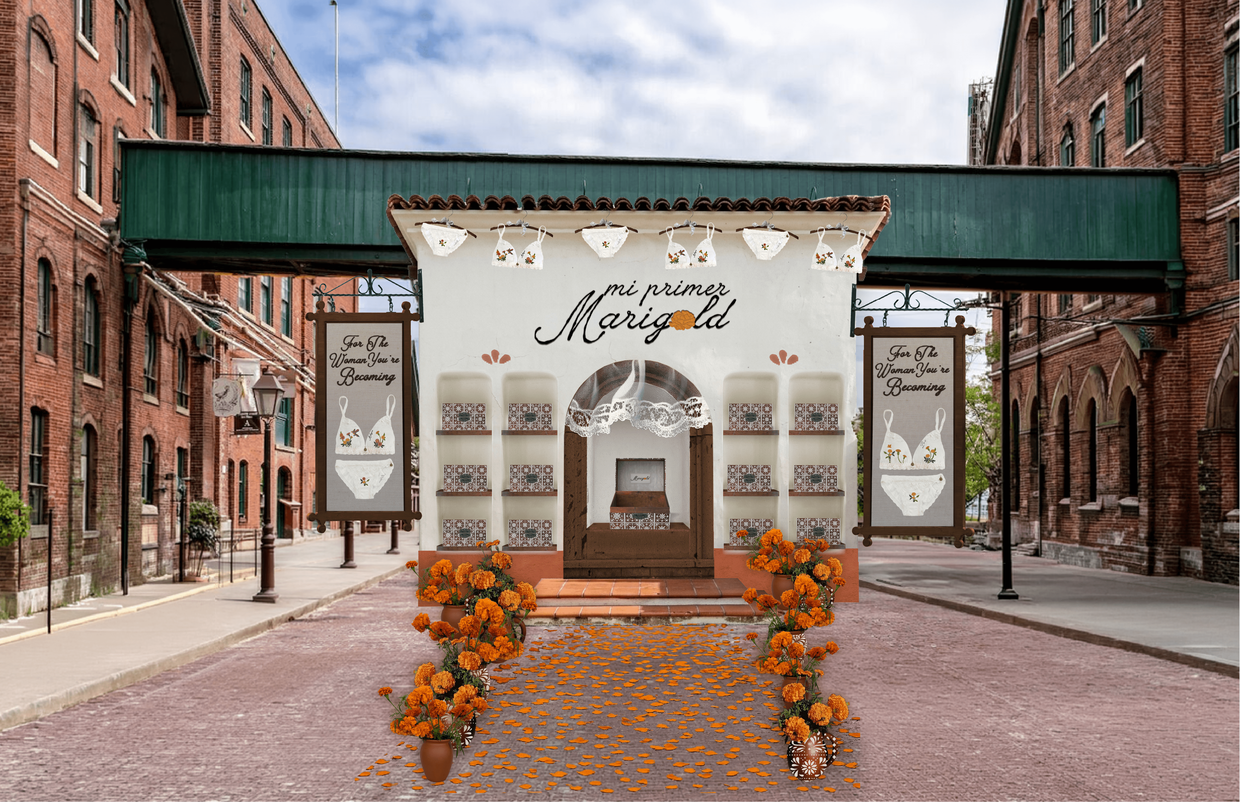
Pop Up Shop
Outcome
Overall, Mi Primer Marigold collection captures girlhood through nostalgia, care, and cultural identity. Rooted in a vintage, rustic aesthetic, the project focuses on creating a keepsake experience rather than just a product, but something personal, lasting, and meaningful.
From the packaging to the garments, each element reflects subtle connections to Mexican culture through texture, craftsmanship, and thoughtful details. Inspired by the warmth of abuelas and everyday rituals, the collection emphasizes softness, tradition, and emotional value.
Mi Primer Marigold is about growing into womanhood while staying connected to where you come from.
Project Type
Package
Duration
4 Weeks
Tools
Illustrator | Photoshop | Figma | Procreate | Pacdora
Illustrator | Photoshop | Figma | Procreate
Mi Primer Marigold
Coming of Age Intimate Apparel Collection
Mi Primer Marigold
Coming of Age Intimate
Apparel Collection
For The Woman She's Becoming
Overview
Marigold is a conceptual Canadian handmade intimate apparel brand inspired by traditional Mexican Otomí embroidery and a rustic way of living.The brand is rooted in the experience of growing up in a Mexican household and in the handmade pieces designed by abuelas, each carrying a sense of warmth, familiarity, and personal, rooted memory. The brand's focus is to create a piece that feels both nostalgic and current in design, for everyday wear, with structured silhouettes that offer support, confidence, and comfort.
Mi Primer Marigold is a gentle introduction to the Marigold world, with a lighter, more delicate tone. The collection feels softer and more playful. Featuring lace, ruffles, patchwork, and embroidery, while staying fun, feminine, and casual rather than overly simple. The goal isn’t to remove beauty or detail, but to express it in a more subtle, tender way, using muted base fabrics accented with brighter embroidery and stitching details.
Want to skip ahead?
Research Insight - Challenging the Visual Stereotypes of Mexican Culture
Mission
I struggled with how to show Mexican culture in a way that felt true to me, without relying on the bright, bold colours people usually associate with it. When I think of Mexico, I do see colour—but I also see something quieter and more personal: small pueblos, vintage textures, and the soft, worn beauty of everyday life. A lot of that comes from visiting my abuelita and seeing the things she made by hand—colourful, but in a more muted, lived-in way. The challenge was finding a balance between those two ideas, and making sure the designs didn’t feel boring or stripped of their meaning.
How can I tell a more intimate story of Mexican culture?
Solution
My solution was to keep going back and reworking things until it felt right. Instead of forcing more colour in, I focused on letting the details speak—using embroidery, stitching, and texture to carry that richness. I kept the base more muted and soft, then added small moments of colour in a way that felt intentional. I also looked for references that matched what I had in my head—less of the stereotypical visuals, and more of the quiet, everyday beauty that people who share that experience would recognize. That helped me stay grounded in what I actually wanted the brand to feel like.
Target Audience
Primary Audience - Young Girls
Age Group:
Young girls ages 9 -13 years old
Girls who are beginning puberty and transitioning from training bras to their first everyday bra.
Secondary Audience - Parents
Parents guiding their daughters through this transition, looking for pieces that feel age-appropriate, comfortable, and thoughtfully designed.
Design Approach
EFE7DF
D49300
D37300
000000
Design Approach
D49300
D37300
EFE7DF
000000
Colour Palette
I chose to focus on a more muted, rustic interpretation of Mexico rather than the stereotypical bright colours. The palette is centred around marigold orange—the brand’s signature—supported by soft neutrals like beige, white, and black.
Typography
The typography blends expression with clarity. En Clair was chosen as the primary typeface for its cultural character and handwritten imperfections, giving the brand a more personal, intimate feel. It is paired with Avenir, whose clean and modern form helps ground the design and maintain readability.
Mood Boards
Sketches
Patterns
Logo Concept
Logo Mockups
Finalized Logo
Package Concept
The packaging was designed with sustainability and longevity in mind, with the intention of creating something that wouldn’t simply be thrown away. Instead of traditional packaging, I developed a reusable keepsake box that continues to have value beyond the initial purchase.
Designed for young girls, the box becomes a place to store meaningful items as they grow—turning it into something personal that evolves over time. This approach allows the packaging to feel more intentional and connected to the user’s experience.
The design is inspired by antique, rustic Mexican chests, bringing in a sense of warmth, history, and craftsmanship. By combining function with sentiment, the packaging becomes more than just a container—it becomes something worth holding onto.
Paper Package Mockups
Digital Package Mockups
Finalized Packaging
The final packaging embraces a vintage, rustic Mexican aesthetic, drawing from the look and feel of traditional keepsake chests. The Marigold logo is placed at the top alongside the phrase “for the woman you’re becoming,” keeping the branding subtle so the piece feels more personal—like something meant to be held onto rather than displayed.
Stitched, tile-inspired textile details wrap around the box, referencing traditional patterns and handcrafted embroidery. These elements bring in a sense of history and cultural familiarity, tying the packaging back to the handmade qualities that inspired the collection.
Inside, the contents are wrapped in linen fabric and separated with a lace divider, echoing the soft, worn textures often found in vintage household textiles. This not only adds to the overall aesthetic but also creates a more thoughtful and organized experience, separating the main product from additional pieces while reinforcing a sense of care, tradition, and longevity.
Introducing Mi Primer Marigold
While the Marigold brand represents womanhood in full bloom, Mi Primer Marigold introduces its first petal. This collection is designed as a gentle entry point for girls aged 9–13, marking an important transition as they begin wearing their first bra.
The collection includes a set of bras and underwear—Milagros, Corazón, Fuerza, and Alma—each created to offer a soft, age-appropriate experience. It intentionally moves away from the over-sexualization often seen in this category, instead embracing innocence, comfort, and playfulness.
Visually, the designs are lighter and more delicate than the core Marigold line. Elements such as lace, ruffles, and subtle patchwork are combined with traditional Mexican embroidery, maintaining cultural identity while adapting it to a younger audience.
The names of each set reflect qualities of womanhood—magic, heart, strength, and soul—serving as a reminder that these traits already exist within young girls and will continue to grow with them over time.
Welcome Note
Milagros Bra
Additionals
For the additional elements in my Marigold project, I included a vintage wooden comb engraved with the Marigold logo to maintain consistency within the branding. Beyond that, the comb carries cultural meaning—within Mexican households, it’s common for an abuelita or mother to gently comb a young girl’s hair. It becomes a quiet, intimate moment of care, patience, and connection.
By including the comb, it becomes more than just an object—it symbolizes those early experiences of girlhood. For young girls, it’s something familiar and functional, but it also carries a sense of comfort and nostalgia. For others who may not have grown up with that tradition, it introduces the idea that something as simple as combing your hair can hold emotional value and memory.
Similarly, the compact mirror is engraved with the Marigold logo and designed with a vintage, antique feel. It reinforces the overall aesthetic of the project, which is rooted in preserving and celebrating vintage elements. The mirror becomes a timeless object, something personal that a young girl can grow with.
Overall, these pieces push back against the idea of fast, disposable modernity. Instead, they highlight objects that are meant to be kept, cherished, and passed down, reminding young girls that value isn’t just in newness, but in meaning, memory, and longevity.
Digitals
Instagram Stories
Website
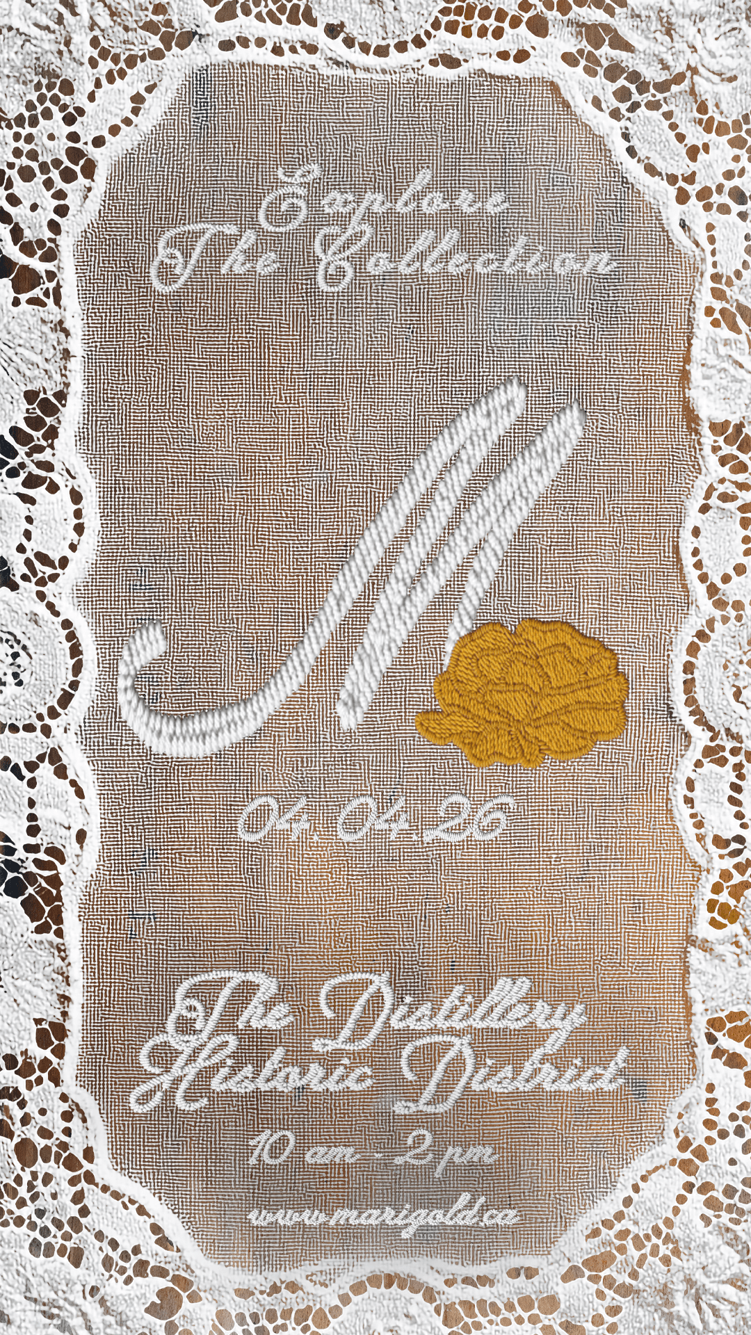
Pop Up Shop
Design Challenges
Problem: Redefining Cultural Representation Beyond Stereotypes
A major design challenge was connecting the project to Mexican culture without relying on obvious or stereotypical visual cues. I initially felt the work needed bright, bold colours to feel “Mexican-inspired,” which conflicted with my softer, vintage, and nostalgic direction. This left me questioning whether the cultural identity and connection to my heritage would still come through.
Solution
Instead of relying on overt elements, I focused on subtle details that reflect Mexican culture through lace, textured fabrics, vintage typography, traditional patterns, and symbolic objects like the comb and mirror. This created a softer, more personal expression of heritage rooted in generational memory and care.
Outcome
Overall, Mi Primer Marigold collection captures girlhood through nostalgia, care, and cultural identity. Rooted in a vintage, rustic aesthetic, the project focuses on creating a keepsake experience rather than just a product, but something personal, lasting, and meaningful.
From the packaging to the garments, each element reflects subtle connections to Mexican culture through texture, craftsmanship, and thoughtful details. Inspired by the warmth of abuelas and everyday rituals, the collection emphasizes softness, tradition, and emotional value.
Mi Primer Marigold is about growing into womanhood while staying connected to where you come from.