Project Type
Branding & Marketing
Duration
5 Weeks
Tools
Photoshop | Illustrator
Do West Fest
A visual campaign bringing
THE Toronto Summer Festival to life.
Do West Fest
A visual campaign for
THE Toronto Summer Festival
Do West Fest
A visual campaign for
THE Toronto
Summer Festival

Making some noise in the West End
Making some noise in the West End
Making some noise in
the West End
Overview
Overview
Do West Fest is a neighbourhood festival in Toronto’s West Queen West area, bringing together local businesses, artists, food, music, and community for a weekend of events and activations.
During my internship at Sixteen Eleven Studios, I was responsible for creating promotional content for the studio’s activation at the festival.
My work included promotional graphics, menu designs, and short-form video content, all created to build excitement around the activation and communicate what visitors could expect. The project allowed me to work across different formats while keeping the visuals cohesive with Sixteen Eleven’s identity and the energy of the festival.
Do West Fest is a neighbourhood festival in Toronto’s West Queen West area, bringing together local businesses, artists, food, music, and community for a weekend of events and activations.
During my internship at Sixteen Eleven Studios, I was responsible for creating promotional content for the studio’s activation at the festival.
My work included promotional graphics, menu designs, and short-form video content, all created to build excitement around the activation and communicate what visitors could expect. The project allowed me to work across different formats while keeping the visuals cohesive with Sixteen Eleven’s identity and the energy of the festival.




Research Insight – Finding the Feeling
Research Insight – Finding the Feeling
Mission
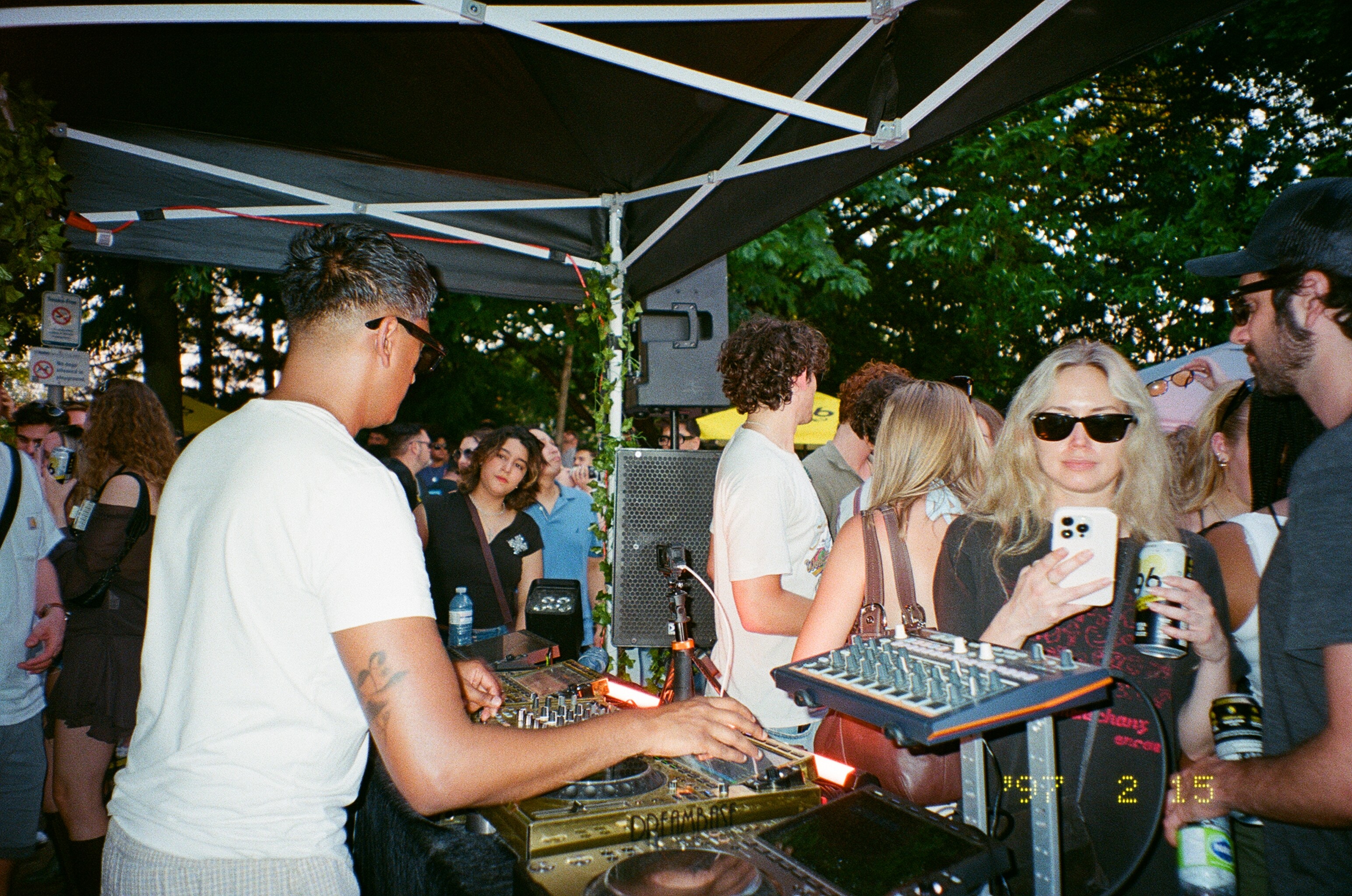
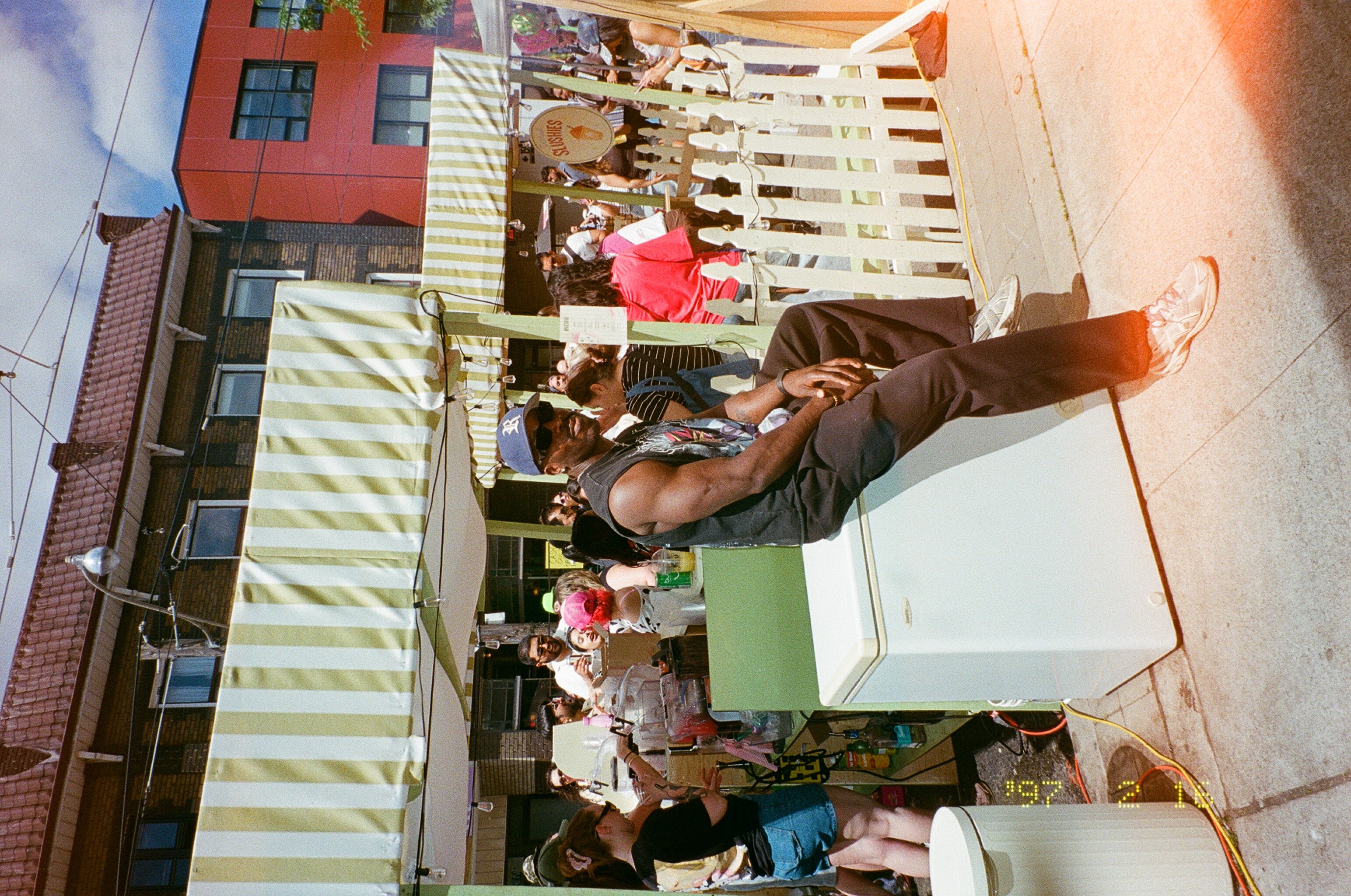
The main goal was to find a way to capture everything Sixteen Eleven was bringing to Do West Fest in a simple, engaging visual. With a DJ set, pop-up shop, lounge area, and signature spiked slushies all part of the activation, the graphics needed to communicate the experience without trying to show every detail at once.
How do you capture an entire festival experience
in a few graphics?
How do you capture an entire festival experience
in a few graphics?
How do you capture an entire festival experience
in a few graphics?
Solution
Rather than focusing on one specific element, I looked at how the overall feeling of the festival could come through visually. The direction became centred around creating a sense of fun, energy, and vibrancy that would make people curious about the activation and want to stop by.
Design Approach
Design Approach
Design Approach
C6E3F7
A6CB9B
FCB90F
FDB6CD
FBFAEA
Colour Palette
We started with the colours of the physical activation (orange, blue, green, and beige), but expanded the palette to feel more playful and energetic. Beige stayed as the base, while brighter colours were introduced to better reflect the carefree energy of Do West Fest.

FBFAEA
FCB90F
C6E3F7
A6CB9B
FDB6CD
C6E3F7
A6CB9B
FCB90F
FDB6CD
FBFAEA
Colour Palette
We started with the colours of the physical activation (orange, blue, green, and beige), but expanded the palette to feel more playful and energetic. Beige stayed as the base, while brighter colours were introduced to better reflect the carefree energy of Do West Fest.
We started with the colours of the physical activation (orange, blue, green, and beige), but expanded the palette to feel more playful and energetic. Beige stayed as the base, while brighter colours were introduced to better reflect the carefree energy of Do West Fest.
Typography
Churchward 69 was used for headlines to carry Sixteen Eleven’s bold, recognizable style, while Futura 100 Book kept the supporting text clean and readable. Together, they created a clear hierarchy while balancing boldness with simplicity.
Churchward 69 was used for headlines to carry Sixteen Eleven’s bold, recognizable style, while Futura 100 Book kept the supporting text clean and readable. Together, they created a clear hierarchy while balancing boldness with simplicity.
Churchward 69 was used for headlines to carry Sixteen Eleven’s bold, recognizable style, while Futura 100 Book kept the supporting text clean and readable. Together, they created a clear hierarchy while balancing boldness with simplicity.

Mood Board

Drafts - Digital Assets


Drafts - Menus


Drafts - Art Installations


Finished Pieces
Finished Pieces
Finished Pieces
Digital Assets + Menu


Art Installation

Promotional Stickers


Extra - Giveaway Assets


Social Media Assets


Design Challenges
Problem 1: Too Many Directions
With a lot of creative freedom, there were endless ways the campaign could look and feel. It became difficult to commit to one direction without feeling like another idea might work better.
Solution
I explored multiple visual directions through quick ideations, layouts, typography, and colour studies before narrowing down what felt strongest. This helped establish a direction that felt intentional rather than settling on the first idea.
Problem 2: Finding the Right Palette
The initial colour palette wasn’t capturing the energy and personality we wanted for the activation.
Solution
I tested different colour combinations and gradually expanded the palette, adding and removing colours until I found a balance that felt vibrant, cohesive, and appropriate for the festival.
Problem 3: Showing the Experience, Not Everything
The activation had so many elements that trying to communicate everything at once could easily become overwhelming.
Solution
Instead of visually listing every part of the activation, I focused on communicating its overall feeling — energetic, social, playful, and inviting — using bold visuals and graphic details that encouraged people to learn more.
Outcome
The final campaign leaned into the funky, fun, and vibrant energy of both Sixteen Eleven Studios and Do West Fest. Since the festival itself is loud, colourful, and carefree, the digital assets were designed to feel just as expressive, bringing the energy of the street into the graphics through bold visuals, playful details, and vibrant colour. The result was a visual presence that felt unmistakably Sixteen Eleven while fitting naturally into the atmosphere of the festival.
Outcome
The final campaign leaned into the funky, fun, and vibrant energy of both Sixteen Eleven Studios and Do West Fest. Since the festival itself is loud, colourful, and carefree, the digital assets were designed to feel just as expressive, bringing the energy of the street into the graphics through bold visuals, playful details, and vibrant colour.
The result was a visual presence that felt unmistakably Sixteen Eleven while fitting naturally into the atmosphere of the festival.
Explore more of my work